We're still working on this feature, but we'd love for you to try it out!
This feature is currently provided as part of a preview program pursuant to our pre-release policies.
Modern Kubernetes environments have evolved into complex, multi-cluster fleets, but traditional observability tools often provide only a fractured, siloed view of individual clusters. This Kubernetes cross-cluster UI provides a unified command center that transforms this multi-cluster complexity into fleet-wide clarity.
This unified view helps Platform Engineers and SREs to:
Unify fleet-wide observability on a single dashboard that's compatible with clusters monitored by New Relic agents or OpenTelemetry.
Accelerate root cause analysis with a guided triage workflow.
Reduce costs by identifying wasted resources across the entire fleet.
Empower developers with an application-centric view for self-service.
Access the new UI
You can access the new Kubernetes cross-cluster UI from the Kubernetes option in the left navigation in the New Relic platform.
Click the Try it out button at the top right corner of the page.
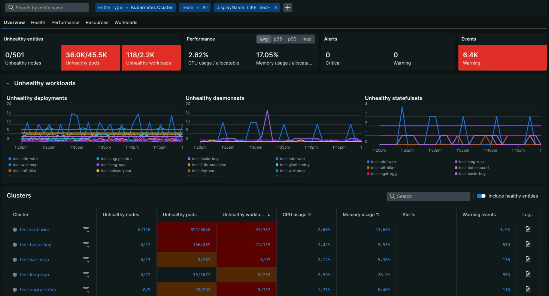
Scorecards and table
Scorecards summarize each metric across your fleet, and the breakdown table categorizes values by cluster, node, or workload. Both scorecards and table rows turn orange (warning) or red (critical) when a value meets a severity threshold. Ratios such as 2/436 change color based on their percentage.
Select avg, p95, p99, or max to update the scorecards and line chart. The breakdown table always displays average values.
Disable Include healthy entities to filter the list to entities with an active orange or red status threshold.
Entities that have stopped reporting remain in the list, displaying historical data for the selected time range.
Drill-down capabilities for triage
You can accelerate root cause analysis with the cross-cluster UI using a guided triage workflow that moves from fleet-wide metrics down to individual entities:
From scorecard to entity ranking: Select a scorecard to sort the table by that metric in descending severity order and plot the top 10 entities in the line chart
From table metric to Kubernetes navigator: Hover the mouse pointer over a metric value to display the entity trend line, then select View in navigator to open the Kubernetes navigator.
From entity to details: Hover over an entity name to see its golden metrics and related entities, or click it to open its overview page.
Tab-specific metrics
The UI is organized into five main tabs. Scorecard: thresholds apply to the scorecards and Table: thresholds apply to table rows. When they're the same, only one set is listed. Counts cover the selected time range.
The Overview tab provides a general summary of the operational health, capacity, and risk across your entire Kubernetes fleet.
Metric name
Description
Importance
Thresholds
Unhealthy nodes
Unhealthy nodes out of all nodes. A node is unhealthy if it isn't ready or reports a pressure or network condition.
Signals widespread instability and potential zone failures across the infrastructure.
Orange: 1% to < 5% of nodes; Red: ≥ 5%.
Unhealthy workloads
Deployments, daemonsets, and statefulsets with missing or unavailable pods, out of all workloads.
Indicates failure to reconcile desired states across the organization.
Orange: 1% to < 5% of workloads; Red: ≥ 5%.
Running pods
Percentage of pods in the Running phase, excluding job pods and completed pods.
Operational success rate; less than 90% running pods indicates widespread failure.
Scorecard: Orange: 90% to < 95%; Red: < 90%. Table: Orange: > 95% to 99%; Red: ≤ 95%.
CPU usage
Node CPU usage as a percentage of allocatable CPU.
Measures aggregate node saturation risk across the entire estate.
Orange: 75% to < 95%; Red: ≥ 95%.
Memory usage
Node memory usage as a percentage of allocatable memory.
High values indicate risk of aggregate eviction storms across clusters.
Orange: 75% to < 95%; Red: ≥ 95%.
Ephemeral storage
Percentage of node filesystem capacity used.
Critical to prevent Kubelet crashes.
Orange: 75% to < 95%; Red: ≥ 95%.
Persistent storage
Percentage of pod volume capacity used.
Critical to prevent stateful application crashes and data write failures.
Orange: 75% to < 95%; Red: ≥ 95%.
Warning events
Number of Kubernetes Warning events.
High noise levels obscure critical alerts and indicate config debt.
Orange: 1 to 49; Red: ≥ 50.
The Health tab focuses on metrics related to the availability and current status of your nodes and pods to detect immediate failure risks.
Metric name
Description
Importance
Thresholds
Nodes ready
Nodes that reported no unhealthy condition, out of all nodes.
Availability metric; values below 95% signal severe fleet instability.
Scorecard: Orange: 95% to < 100%; Red: < 95%. Table: Cluster rows: Orange: > 1% to 2% of nodes ready; Red: ≤ 1%. Node rows: Red: FALSE.
Symptom of hardware failure or systemic CNI issues.
Scorecard: Orange: 11 to < 50 per 100 nodes; Red: ≥ 50 per 100 nodes. Table: Orange: 5 to 10; Red: ≥ 11.
Warning events
Number of Kubernetes Warning events.
High noise levels obscure critical alerts and indicate config debt.
Orange: 1 to 49; Red: ≥ 50.
The Performance tab measures utilization against total capacity and limits to identify node saturation and risk of performance degradation.
Metric name
Description
Importance
Thresholds
CPU usage (total)
Node CPU usage as a percentage of allocatable CPU.
Measures saturation risk across the entire estate.
Orange: 75% to < 95%; Red: ≥ 95%.
CPU usage (limits)
CPU usage as a percentage of CPU limits, where set.
Measures proximity to throttling.
Orange: 75% to < 95%; Red: ≥ 95%.
Memory usage (total)
Node memory usage as a percentage of allocatable memory.
Proximity to eviction thresholds.
Orange: 75% to < 95%; Red: ≥ 95%.
Memory usage (limits)
Memory working set as a percentage of memory limits, where set.
Proximity to OOMKill events.
Orange: 75% to < 95%; Red: ≥ 95%.
Ephemeral storage
Percentage of node filesystem capacity used.
Critical to prevent Kubelet crashes.
Orange: 75% to < 95%; Red: ≥ 95%.
Pod capacity
Running pods as a percentage of the maximum pods that nodes can run.
Measures resource density and slot exhaustion.
Orange: 85% to < 100%; Red: ≥ 100%.
Warning events
Number of Kubernetes Warning events.
High noise levels obscure critical alerts and indicate config debt.
Orange: 1 to 49; Red: ≥ 50.
The Resources tab analyzes Request vs. Usage and Request vs. Limits to assess resource allocation efficiency and identify waste or sizing inaccuracies.
Metric name
Description
Importance
Thresholds
CPU usage vs requests
CPU usage as a percentage of CPU requests.
Governance metric for sizing accuracy and waste.
Scorecard: Orange: < 70% or ≥ 200%. Table: Orange: < 70% or > 200%.
CPU requests vs limits
CPU requests as a percentage of CPU limits.
Measures performance headroom and burst capacity.
Orange: 75% to < 95%; Red: ≥ 95%.
CPU throttling
Percentage of CPU periods in which containers were throttled.
Measures latency/lag caused by CFS quotas.
Orange: 10% to < 50%; Red: ≥ 50%.
Memory usage vs requests
Memory usage as a percentage of memory requests.
Governance metric for memory sizing accuracy.
Scorecard: Orange: < 70% or ≥ 200%. Table: Orange: < 70% or > 200%.
Memory requests vs limits
Memory requests as a percentage of memory limits.
Helps to assess resource allocation efficiency and potential overprovisioning.
High noise levels obscure critical alerts and indicate config debt.
Orange: 1 to 49; Red: ≥ 50.
The Workloads tab provides an application-centric view of your deployments, daemonsets, and statefulsets, focusing on metrics such as readiness, restarts, and missing replicas to diagnose application instability and poor QoS.
Metric name
Description
Importance
Thresholds
CPU usage (requests)
CPU usage as a percentage of CPU requests.
Measures how close the workload is to exceeding its requested CPU.
Orange: 75% to < 95%; Red: ≥ 95%.
CPU throttling
Percentage of CPU periods in which containers were throttled.
Measures latency/lag caused by CFS quotas.
Orange: 10% to < 50%; Red: ≥ 50%.
Memory usage (limits)
Memory working set as a percentage of memory limits, where set.
Proximity to OOMKill.
Orange: 75% to < 95%; Red: ≥ 95%.
Pods ready/total
Ready pods out of all pods.
Shows whether all of the workload's pods are available.