New Relic Lookout gives you visibility into important deviations from across your entire digital estate. Go to one.newrelic.com > New Relic Lookout.
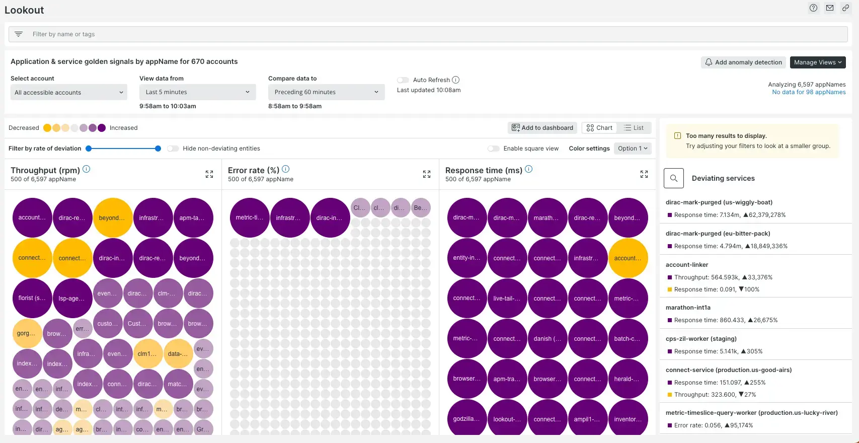
Know exactly where to focus your attention with New Relic Lookout. The brighter the circle color, and the bigger the circle is, the greater the deviation in its signal. Then dig deeper with correlations and abnormal history to see how it impacts your whole system, with no configuration required.
Why it matters
New Relic Lookout helps software teams of any size discover potential issues before they have an impact.
- Fill gaps in monitoring with full coverage out-of-the-box, no configuration or setup required.
- Immediately see anything deviating from normal across your entire estate.
- Proactively spot emerging problems in a real-time visualization of all system components.
- Gain faster incident resolution through automatically surfaced causes and effects.
- Analyze any data in New Relic database (NRDB), including third-party, open, and custom data.
- Launch into other areas of the New Relic platform for deeper understanding
The two Lookout experiences
There are two versions of New Relic Lookout:
- The global version of Lookout: This version of Lookout shows you data and deviations from across all your monitored entities. This also gives you data spanning 13-months, correlations, profiles, traces, and other details. You access this by going to All Capabilities and clicking on Lookout, and it shows up on your left-side nav.
- Requires being a full platform user.
- Requires Pro or Enterprise edition.
- If you are on Standard edition, you can still use the New Relic Lookout view in the New Relic Explorer. You must upgrade to a higher edition if you want to see data spanning 13-months or to visualize anomalies for custom signals views.
- Lookout for specific entities: A simpler version of Lookout that you can use to explore specific entity types. For example, you can go to APM and services and access Lookout, and see data and deviations for those entity types.
- Available to all user types.
Recent changes
On April 24, 2023, we made some changes to New Relic Lookout. For example, we've changed what the size of circles means. For a summary of changes, see our What's new? post.
Get started with New Relic Lookout
The default view provides insight into three key service performance indicators broken down by application: throughput, response time, and errors. We analyze these metrics to show how the data has behaved during the last five minutes compared to the prior hour.
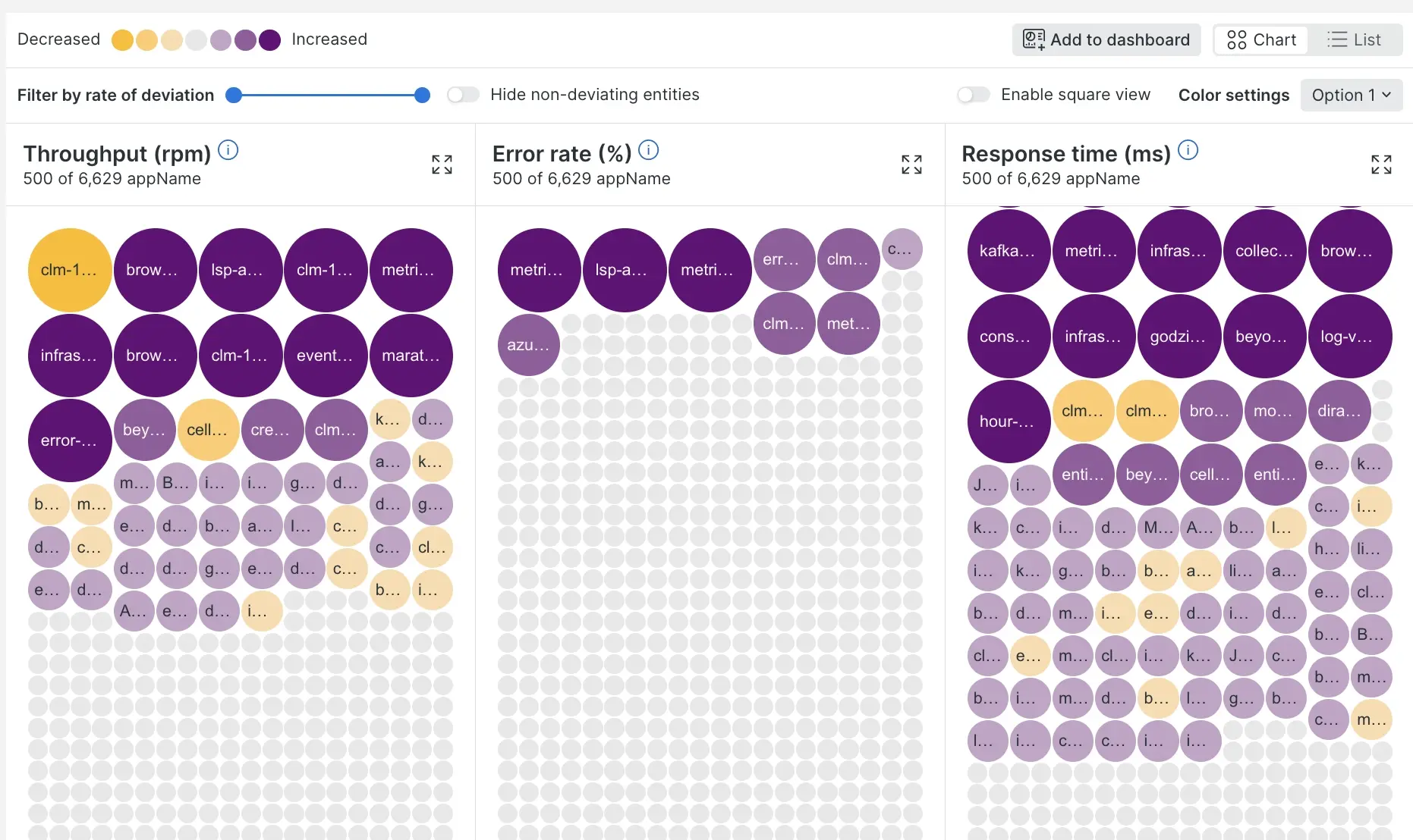
**one.newrelic.com > New Relic Lookout: Anything that significantly deviates from the trend is automatically discovered by New Relic Lookout, which doesn't require any configuration.
Circle visualization and table view
Each application (or other facet) is represented by a circle. The size of a circle indicates the magnitude of the deviation of the signal for that application. The color of the circle indicates whether the value has significantly decreased or increased in the last five minutes, based on the standard deviation of the prior hour (default evaluation and comparison time windows).
Entities are sized, colored, and ordered by rate of deviation. A maximum of 500 entities will be displayed at a time. You can filter your data to focus your analysis.
The type of signal is important when interpreting your results. When you first look at the legend below, you might be tempted to interpret yellow as good and dark purple as bad, but that is not always the case. Here are some examples:
- In the APM/services golden signals, a dark yellow circle in Throughput might signify that something bad has occurred and led to a drop in traffic. At the same time, a dark purple circle might also be concerning due to unexpected load. Both are significant findings worth exploring.
- In browser golden signals, a dark purple circle in Page Views might be great, as you are seeing more traffic to your site!

The legend allows you to change the colors used to highlight deviating services
To change the color palette, click the gear icon by the low-high color legend. This allows you to change the colors used to highlight deviating services. To get a table view of the same data, click the toggle on the right. You can also hover over each color to filter the view by degree lower or higher deviance.
Abnormal golden signals
On the right, New Relic Lookout displays the most significantly deviating applications (or other facet) in a side panel, weighted by both the magnitude of the performance indicators and the scale of their deviations. Details include the name of the key performance indicator, their magnitude during the recent time window, and the difference between the averages from one time compared to the other.
Instant search
Click the magnifying glass icon in the side panel to open a search box. Typing into the search box filters the circles, table, and abnormal signals to applications (or other facets) that contain the text. This is a good way to quickly zoom to various subsystems. New Relic Lookout doesn't rerun the analysis when using the instant search.
Change view
The right side panel shows you all the entity-specific golden signals you can toggle between out of the box.
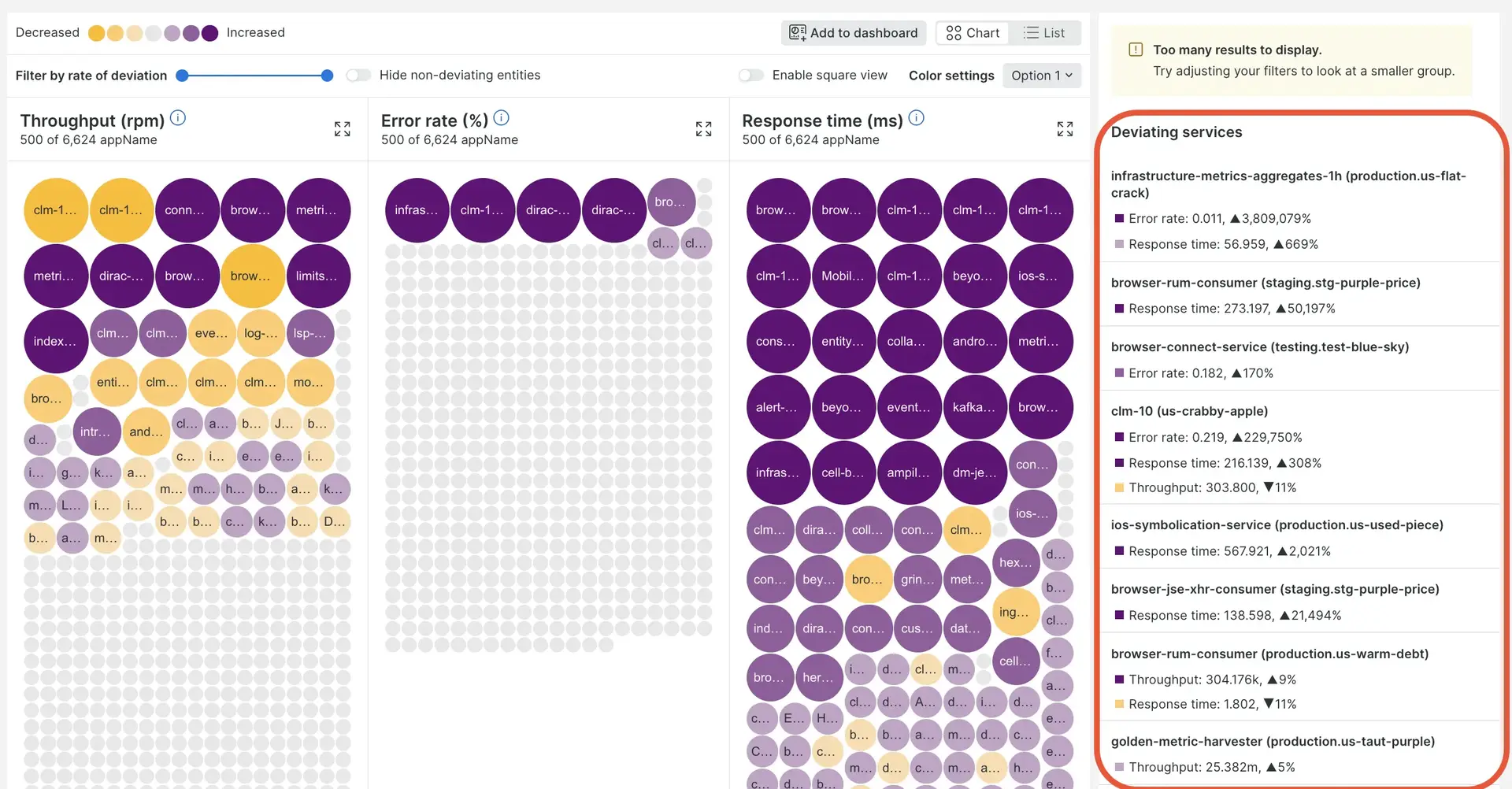
By choosing the Browser Golden Signal or other views, you can change from the default view. Each new view will have the golden signals appropriate for that entity type.
Create a custom view
To target signals and time windows beyond the default values, click the Change view button and select Custom view.
To create your own view:
Select the account or subaccount.
Select the data type (metrics or events). Different functionality is available depending on the type.
In View a chart with, select the metric or event you are interested in. Default is golden signals (throughput, response time, and errors). You can also build custom queries (filters) to target a signal that isn't on the list.
In Facet by, select what the circles represent. Default is
appName, but you can also choosehostor any other facetable attribute available for the signal you’ve selected.If you plan to save/favorite this new view, provide a name in the Name your view box. Keep in mind that you can edit this view at any time using the pencil icon.
The default time windows analyzed by New Relic Lookout are the last five minutes compared to the hour before. Use the time controls (View data from and Compare data to) to target other time windows.
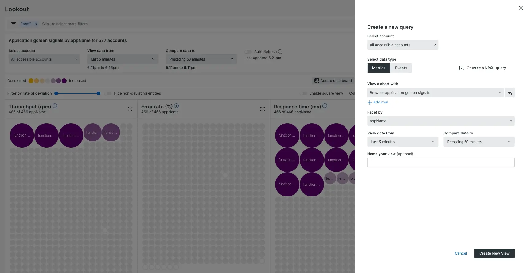
one.newrelic.com > All capabilities > Apps > New Relic Lookout: All event and metric data in New Relic can be queried using the Edit query feature.
Click Analyze to begin analyzing the signal you've selected.
You can also create your own query. To do that:
- Click Custom view, then change it from Basic to Advanced.
- Select the data type (metrics or events).
- Enter your query using NRQL. Note that not all NRQL features are available for this feature.
- By default, we run this query using the last five minutes of data compared to the previous hour. Some examples of the syntax for changing the comparison and evaluation time windows are below.
- Click Analyze.
Diagnose anomalies with Lookout
To analyze an application or facet, click a circle, table row, or abnormal golden signal. When clicked, the button opens a diagnostic tool you can use to explore details about your golden signals. The details panel shows a link to the affected entity, the golden signals over time and deviations of the performance indicator, and recent alert and deployment activity for that entity, when available.
There are up to five tabs available. The details of the individual tabs are outlined further.
Workload change tab
The Workload change tab helps you spot patterns in event attributes that might be related to the deviation in the main entity.
You can select an event type to see how the values of its event attributes changed for your entity in the selected time period against the preceding same duration. A timeline visualization is provided to show the sample time period and the preceding comparison time period.
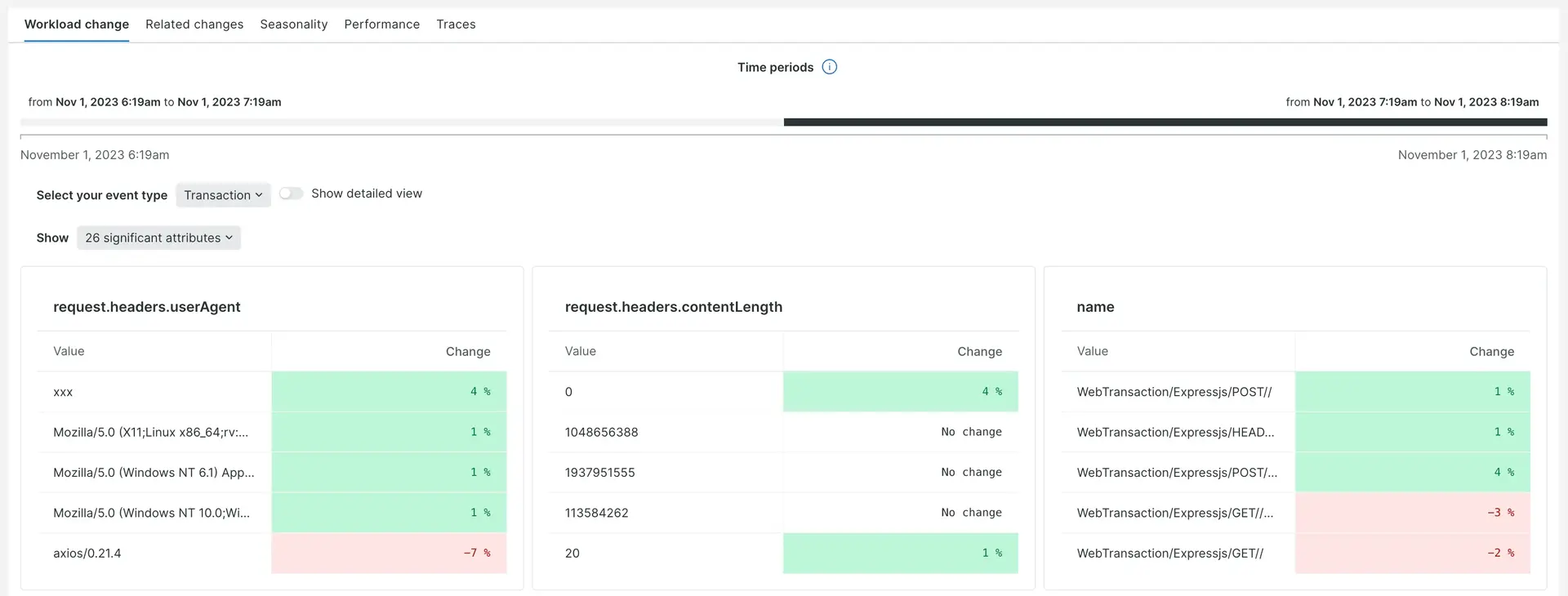
To visualize and analyze a specific event attribute, toggle Show detailed view.
Related changes tab
The Related changes tab shows correlated behavior in the golden signals of related entities for a selected golden signal of the main entity. New Relic Lookout can find other signals that began behaving differently around the same time as the selected signal for that entity type. Clicking the name of the signal reruns the analysis, focusing on that key performance indicator. You can select the different golden signals and you can view signals which have a high or low confidence score. This tab displays a table format and, to dig in further, you can click through to the correlated entity.

Seasonality tab
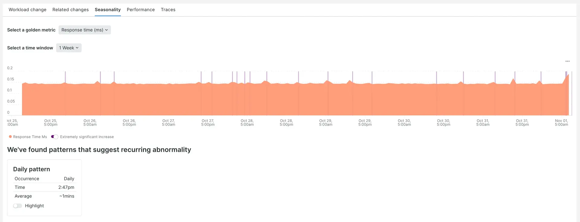
The Seasonality tab shows the changes in the selected golden signal over time and also surfaces any patterns in the anomalies that we find. Once you select the golden signal you can then view the data over an hour, a day or a week. The anomaly patterns are also presented in a table below the chart and you can click on a link to see more details of the anomaly.
Performance tab
The Performance tab shows charts for other key performance indicators for the selected application or facet. When the target is a New Relic application, we show the top transactions, error classes, external services, and database operations, alongside links to the relevant features. If there is no data for any of these, the charts are not shown.
Traces tab
The Traces tab is displayed only if the entity has distributed traces configured and available in the selected evaluated time window. Each card shows a summary of a trace and can be clicked for details. Explore all traces links to the distributed traces application, filtered to the selected entity.