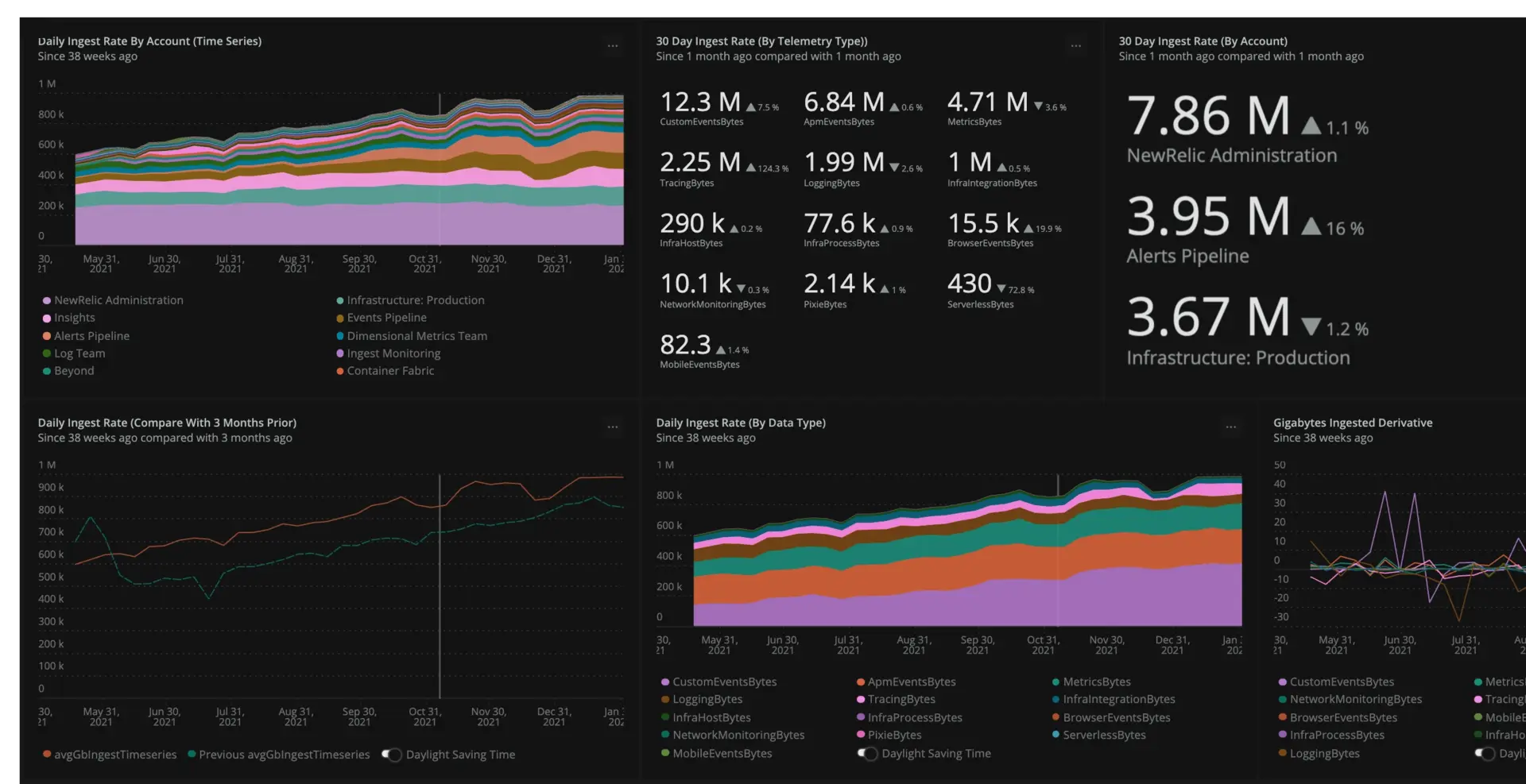
Before you can optimize your data, it's necessary to get a high level view of all the telemetry your organization currently generates. To do this, you'll need to break down ingest data into various groups such as account, telemetry type, and application. Once you do, you'll be able to customize your report, download and install optional dashboards for further granularity, and optimize your telemetry so that you can understand exactly which groups within your organization are contributing which types and amount of data.
This tutorial covers how to generate a report for your data based on the organization, accounts, and type of telemetry data. Once created, you'll learn how to create detailed breakdowns of the data based on application type, kubernetes cluster, and infrastructure integration.

Install the data ingest governance baseline dashboard
This is the dashboard you'll use to create baselines and monitor your ingest data. The Overview tab provides a variety of charts to help keep an eye on your ingest, and there are multiple tabs that provide detailed views of specific telemetry types such as browser data, APM data, logs, and traces.
For generating the report you need to begin optimizing your telemetry, you need to use the Baseline Reports tab after you install the dashbaord using the steps below:
To install the dashboard:
- Navigate to the data ingest governance quickstart.
- Click Install this quickstart in the upper right portion of your browser window.
- Select your primary or top-level account in the account switcher, if applicable.
- Click Done.
- When the quickstart finishes installing, open the Data ingest governance baseline dashboard.
Add ingest target indicators to your dashboard
Once you've set up the baseline dashboard, you should add target indicators to the dashboard to monitor. These indicators help you optimize your ingest data by providing target metrics for you to either exceed or stay below, depending on your needs. Some targets you may want to create are:
An overall organizational target on daily rate or monthly ingest.
Targets per data type to ensure the optimal breakdown (for example 1 TB per day for logs and 2 TB per day for metrics).
Targets for specific sub-accounts or business units.
To add these target indicators to your dashboard, you can either create new charts entirely or modify charts that already exist in the dashboard.
To create a new chart:
In the baseline dashboard, select + Add widget.
Select Add a chart.
Enter the NRQL query that the chart will use.
Select Run.
For example, if you wanted your total organizational ingest to be less than 360 TB per month, you can add a threshold line chart by adding the static number
360000to yourSELECTstatement using the following NRQL statement:SELECT 360000, rate(sum(GigabytesIngested), 30 day) AS '30 Day Rate' FROM NrConsumption WHERE productLine='DataPlatform' since 30 days ago limit max compare with 1 month ago TIMESERIES 7 daysTo modify an existing chart:
In the baseline dashboard, select ... for the chart you want to modify.
Select Edit.
Modify the NRQL query that the chart uses as needed.
Select Run.
For example, after creating the chart above, you may decide that you want to create a daily ingest rate target by dividing 360000 by 30 and using 12000 as the daily target number. To do that, you would update the
Daily ingest rate (compare with 3 months prior)chart using the following query:SELECT 12000, rate(sum(GigabytesIngested), 1 day) AS avgGbIngestTimeseries FROM NrConsumption WHERE productLine='DataPlatform' TIMESERIES AUTO since 9 months ago limit max COMPARE WITH 3 months ago
Generate your 30-day ingest report

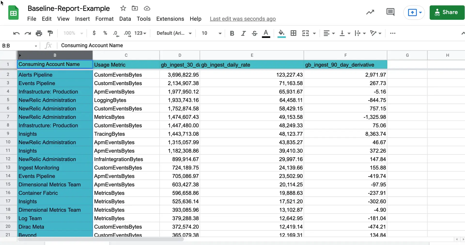
Once you've installed the baseline dashboard and changed the data it reports to suit your needs, you can generate a tabular report of your ingest data after enough time has passed for you to gather the appropriate amount of data you. You can do this from the Baseline report, and the most common timespan is 30 days. To generate the report:
Open the previously installed data ingest governance baseline dashboard.
Select the Baseline report tab.
Select ... on the Last 30 days table and choose Export as CSV.
Choose whether to import the CSV into Google Sheets or another spreadsheet of your choice.
Sugerencia
If you didn't install the dashboard, you can also access this query and create a custom chart in the query builder:
SELECT sum(GigabytesIngested) AS 'gb_ingest_30_day_sum', rate(sum(GigabytesIngested), 1 day) AS 'gb_ingest_daily_rate', derivative(GigabytesIngested, 90 day) as 'gb_ingest_90_day_derivative' FROM NrConsumption WHERE productLine='DataPlatform' since 30 days ago facet consumingAccountName, usageMetric limit max
Customize your report
After you create your ingest report, you can add further customizations to it. It's a good idea to tweak the report to your organization's needs, and doing so can help you when the time comes to start optimizing your ingest. There are two fields you can use to customize your report:
- Notes: Note any growth anomalies as well as possible explanations for them.
- Technical contact: Name of the manager of a given account or someone related to the specific telemetry type.
Now that you've created your baseline report and customized it as needed, you can move on to using that report to find anomalies.