---
title: Chart types
source: https://docs.newrelic.com/docs/query-your-data/explore-query-data/use-charts/chart-types
---
When building a query using the [query builder](https://docs.newrelic.com/docs/query-your-data/explore-query-data/query-builder/introduction-query-builder/), there are a variety of types of visualizations for presenting your data in the optimal format.
This table contains all chart types. Whether a chart type is available for your query will be dependent on:
- The type of query (some query results don't match some chart types)
- The query mode (basic or advanced)
## Area chart [#widget-areachart]
An area chart shows a time series for a single attribute.
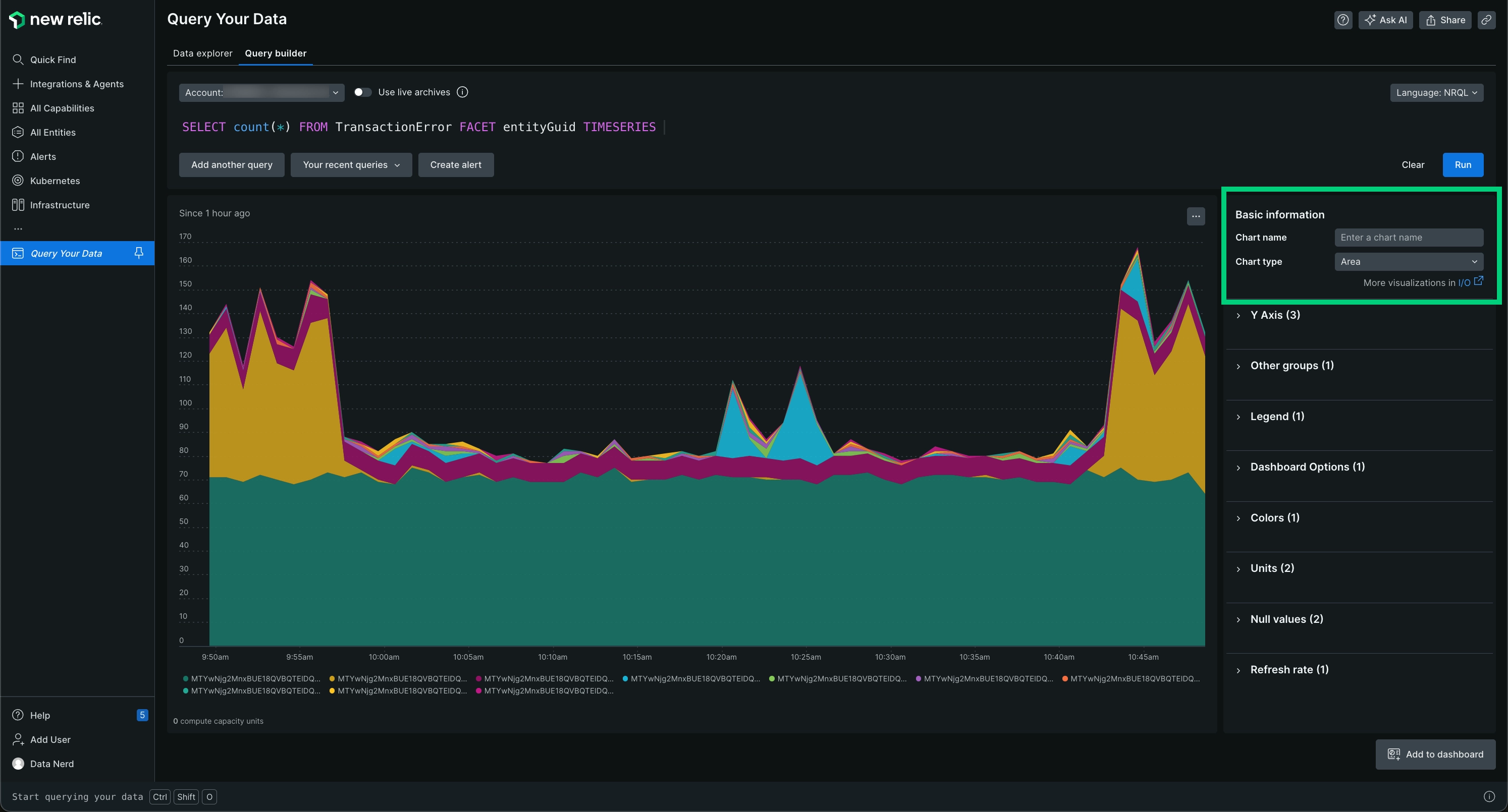
The area chart type shows a time series for a single attribute.
To enable an area chart, add a [`FACET`](https://docs.newrelic.com/docs/insights/nrql-new-relic-query-language/nrql-reference/nrql-syntax-components-functions#sel-facet) to your query.
You can use facet to add up to five attributes, separated by commas. Use the [`TIMESERIES`](https://docs.newrelic.com/docs/insights/nrql-new-relic-query-language/nrql-reference/nrql-syntax-components-functions#sel-timeseries) function when you use a `FACET` in an NRQL query.
| Use an area chart when you want to | View the measurement of a single attribute over a period of time that you specify. |
| ------------------------------------ | ---------------------------------------------------------------------------------------------------------------------------------------------------------------------------------------------------------------------------------------------------------------------------------------------------------------------------------------------------- |
| Avoid an area chart when you want to | View a chart that contains more than a single attribute. The [line chart type](#widget-linechart) is a good option; you can view multiple attributes over a time range that you specify. The [bar chart type](#widget-barchart) gives you a comparison view between the attributes; it uses a total of each attribute for the time range you choose. |
## Bar chart [#widget-barchart]
The bar chart compares values across the categories or series returned by your query. It's the default visualization for most non-time-series queries.
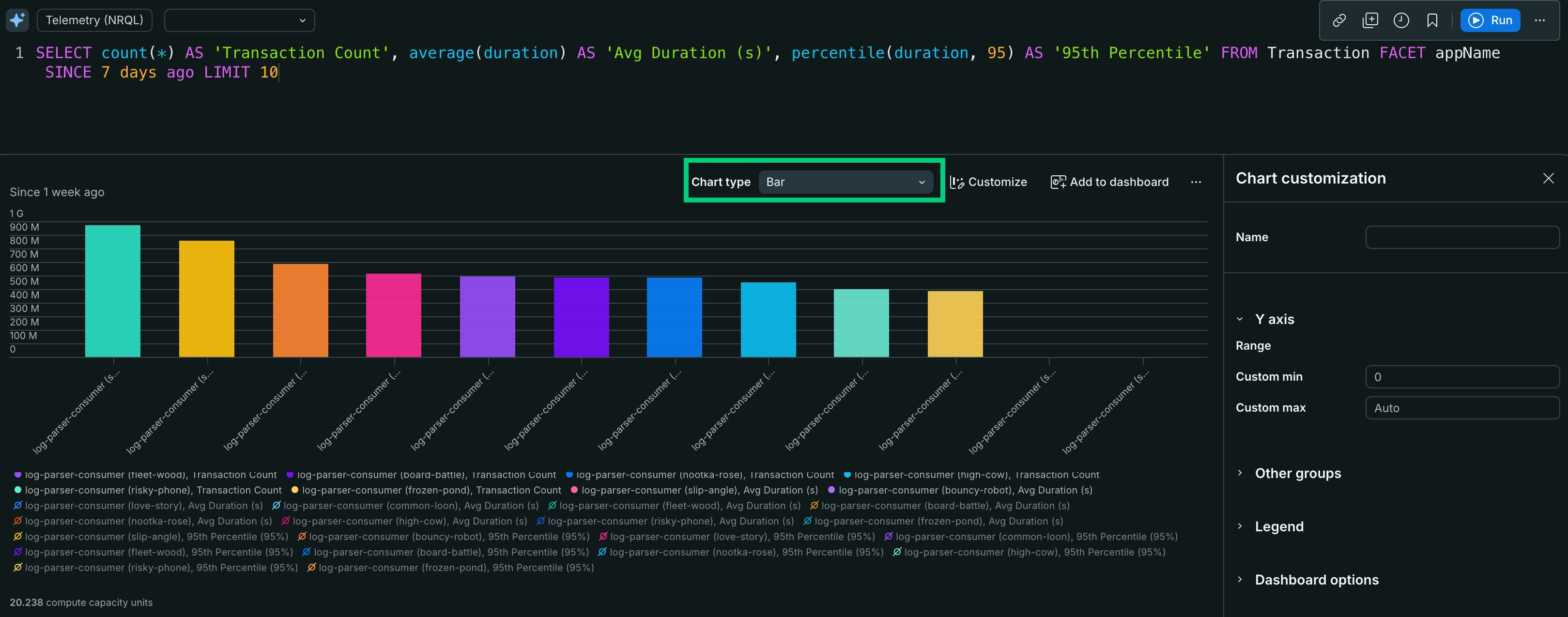
The bar chart compares values across categories or series.
The bar chart supports both categorical (non-time-series) and time-series data. For a categorical comparison, add a [`FACET`](https://docs.newrelic.com/docs/insights/nrql-new-relic-query-language/nrql-reference/nrql-syntax-components-functions#sel-facet) clause to the query, such as:
```sql
SELECT count(*) AS 'Transaction Count', average(duration) AS 'Avg Duration (s)', percentile(duration, 95) AS '95th Percentile' FROM Transaction FACET appName SINCE 7 days ago LIMIT 10
```
You can use `FACET` with up to 5 different attributes, separated by commas.
The bar chart sets the y-axis range automatically, and you can configure it to fit your data.
To compare several series against a single largest series, use the [simplified bar chart](#widget-simplified-barchart) instead. Compared to the simplified bar chart, the bar chart doesn't provide:
- Infinite-series scrolling
- Horizontal, collision-free labels
- The first series fixed at 100% of the bar width
| Use a bar chart when you want to | Compare totals across categories or series with a configurable y-axis. The bar chart is the default visualization for most non-time-series queries. |
| ---------------------------------- | --------------------------------------------------------------------------------------------------------------------------------------------------- |
| Avoid a bar chart when you want to | Compare several series against a single largest series. The [simplified bar chart](#widget-simplified-barchart) is a better option for that view. |
## Billboard [#widget-billboard]
The billboard chart type presents results as a single, highly-visible value. It's an option when your query returns a single number, such as from this query:
```sql
SELECT uniqueCount(session) FROM PageView SINCE 1 day ago
```
A billboard chart is useful for single-stat queries like the [Apdex](https://docs.newrelic.com/docs/apm/new-relic-apm/apdex/apdex-measure-user-satisfaction) function. Use billboards to monitor values at a glance.
You can also use billboards to compare a single value across states. For instance, use the [`COMPARE WITH`](https://docs.newrelic.com/docs/insights/nrql-new-relic-query-language/nrql-reference/nrql-syntax-components-functions#sel-compare) clause to compare the same attribute across two different time frames.
> #### ⚠️ IMPORTANT
>
> Billboard charts that use the `COMPARE WITH` clause won't show percentages percentages or render correctly with public chart links, exported images, and PDFs.
To enable the data for a billboard chart, search for a single value. You can view multiple values by adding a facet from the dropdown.
**Thresholds**
Optionally, you can set **Good**, **Warning**, **Approaching critical**, **Critical**, or **Neutral thresholds** on billboards.
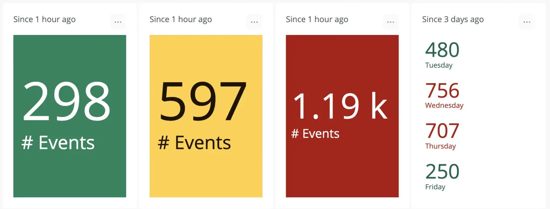
The billboard chart displays a single value in an extra-large font, which can help draw attention to a specific value in a busy dashboared. The background color changes based on your thresholds.
Here are some tips to help you with thresholds:
- For percentages, use a decimalized format. For example, if your threshold is 99.5%, divide by 100 and set the value to 0.995.
- If you want to highlight a chart when a value falls below a given value rather than above it, set the **Warning** threshold higher than the **Critical** threshold.
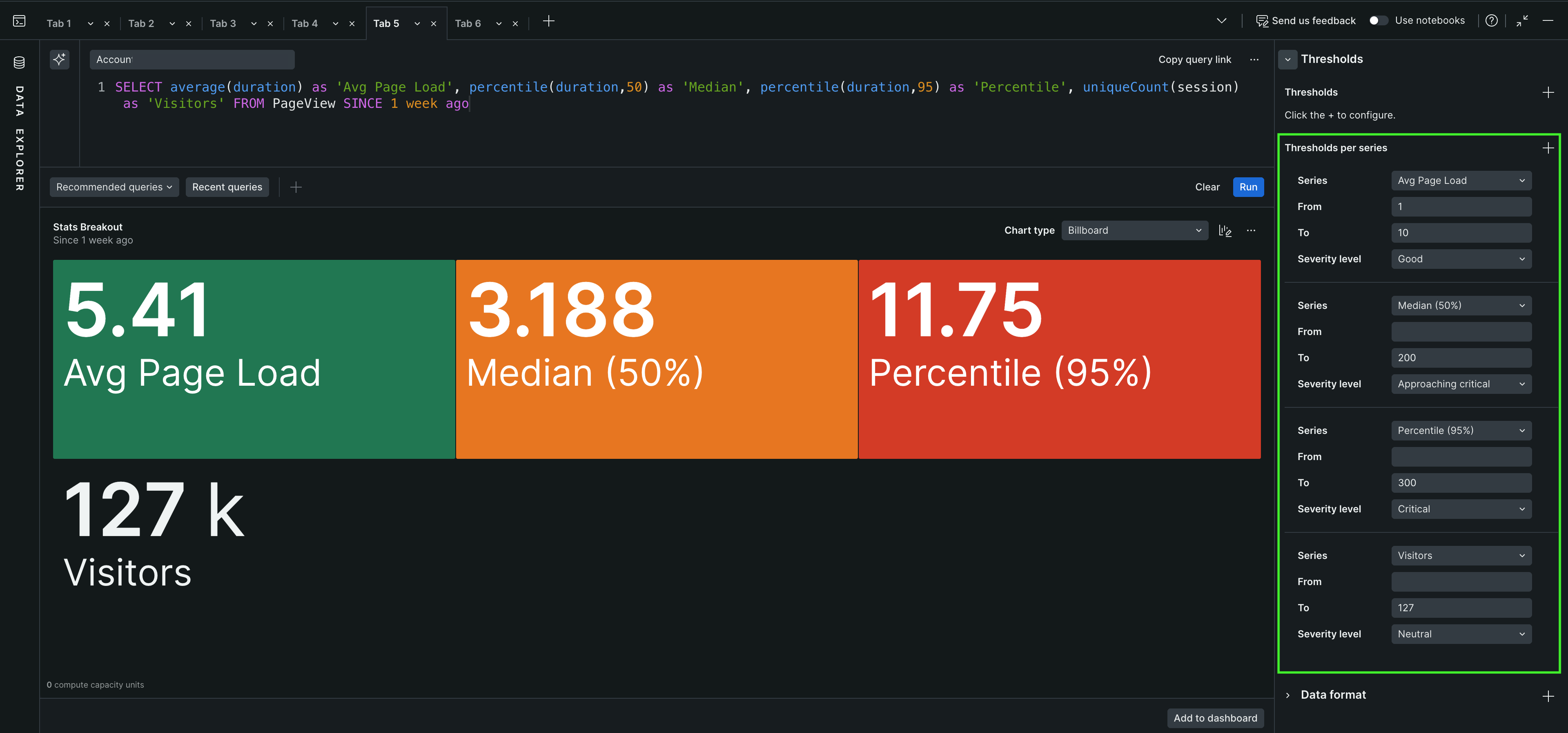
**Thresholds per series**
Using the **Thresholds per series** option, you can set **Good**, **Warning**, **Approaching critical**, **Critical**, or **Neutral** thresholds on billboards. Once set, if your service is working correctly, the chart's full box is green. When a threshold is crossed, the chart turns yellow (warning) or red (critical).
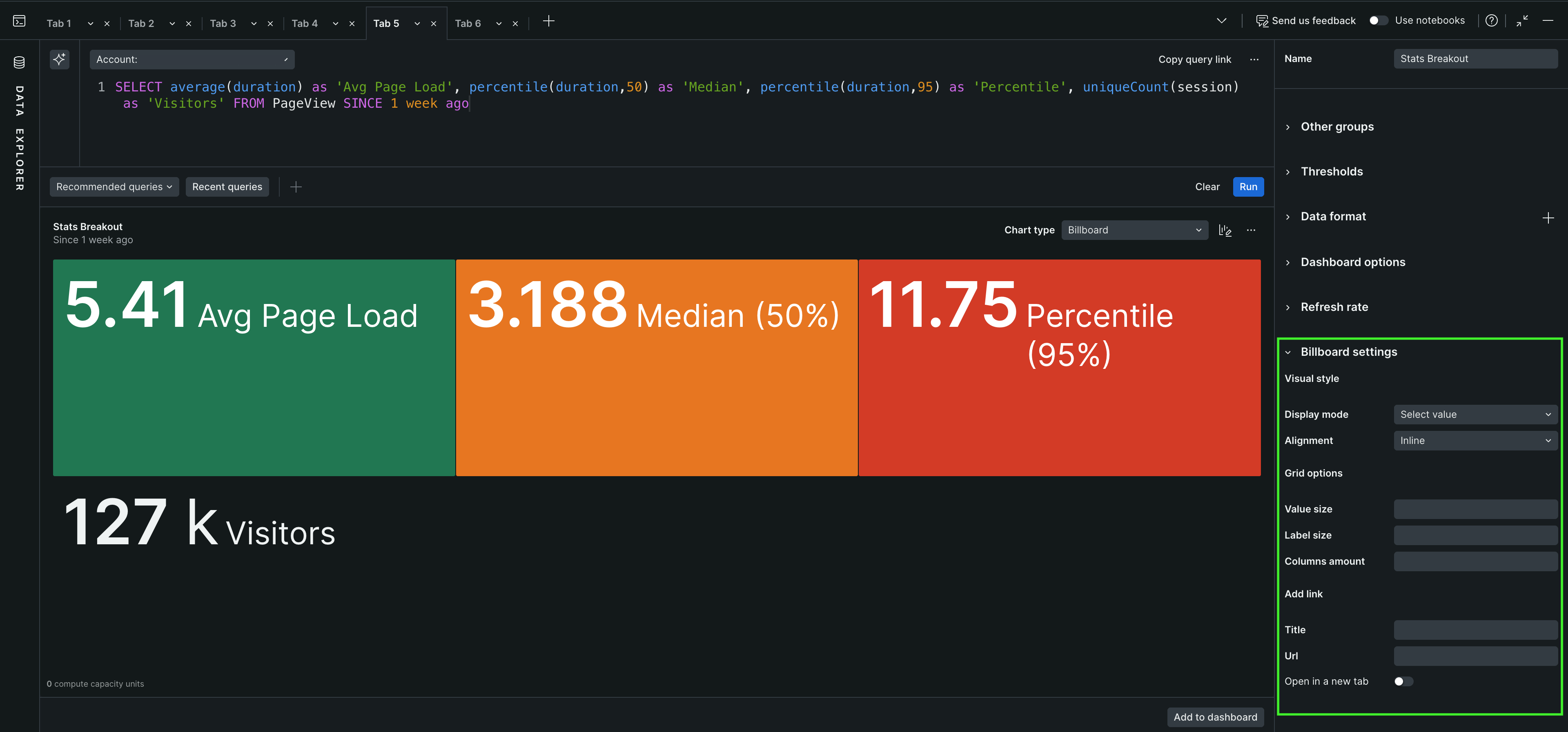
**Billboard settings**
You can configure the following settings for a billboard chart:
- **Visual style**
| Field name | Description |
| ------------ | ------------------------------------------------------------------------------------------------------------------------------------------- |
| Display mode | Select the display mode for the billboard chart. You can choose **Auto**, **Value and label**, **Value only**, **Label only**, or **None**. |
| Alignment | Select the alignment for the billboard chart. You can choose **Stacked (Default)** or **Inline**. |
- **Grid options**
| Field name | Description |
| -------------- | --------------------------------------------------------------- |
| Value size | Select the size of the value displayed in the billboard chart. |
| Label size | Select the size of the label displayed in the billboard chart. |
| Columns amount | Select the number of columns to display in the billboard chart. |
- **Add link**
| Field name | Description |
| ---------- | --------------------------------------------------------------------------- |
| Title | Enter the title for the link that will be displayed in the billboard chart. |
| Url | Enter the URL for the link that will be displayed in the billboard chart. |
**Uses**
| Use a billboard chart when you want to | Monitor values, including thresholds for **Critical** and **Warning** states, in a large, easy-to-read font. |
| -------------------------------------- | ---------------------------------------------------------------------------------------------------------------------------------- |
| Avoid a billboard chart type when | You want to view data over a period of time. The [line chart type](#widget-linechart) is a better option for viewing data by time. |
## Bullet chart [#bullet-chart]
Use the bullet chart type to represent progress to a target or goal, called the limit. To use this chart type, run a query that returns a single number, such as:
```sql
SELECT uniqueCount(session) FROM PageView SINCE 1 day ago
```
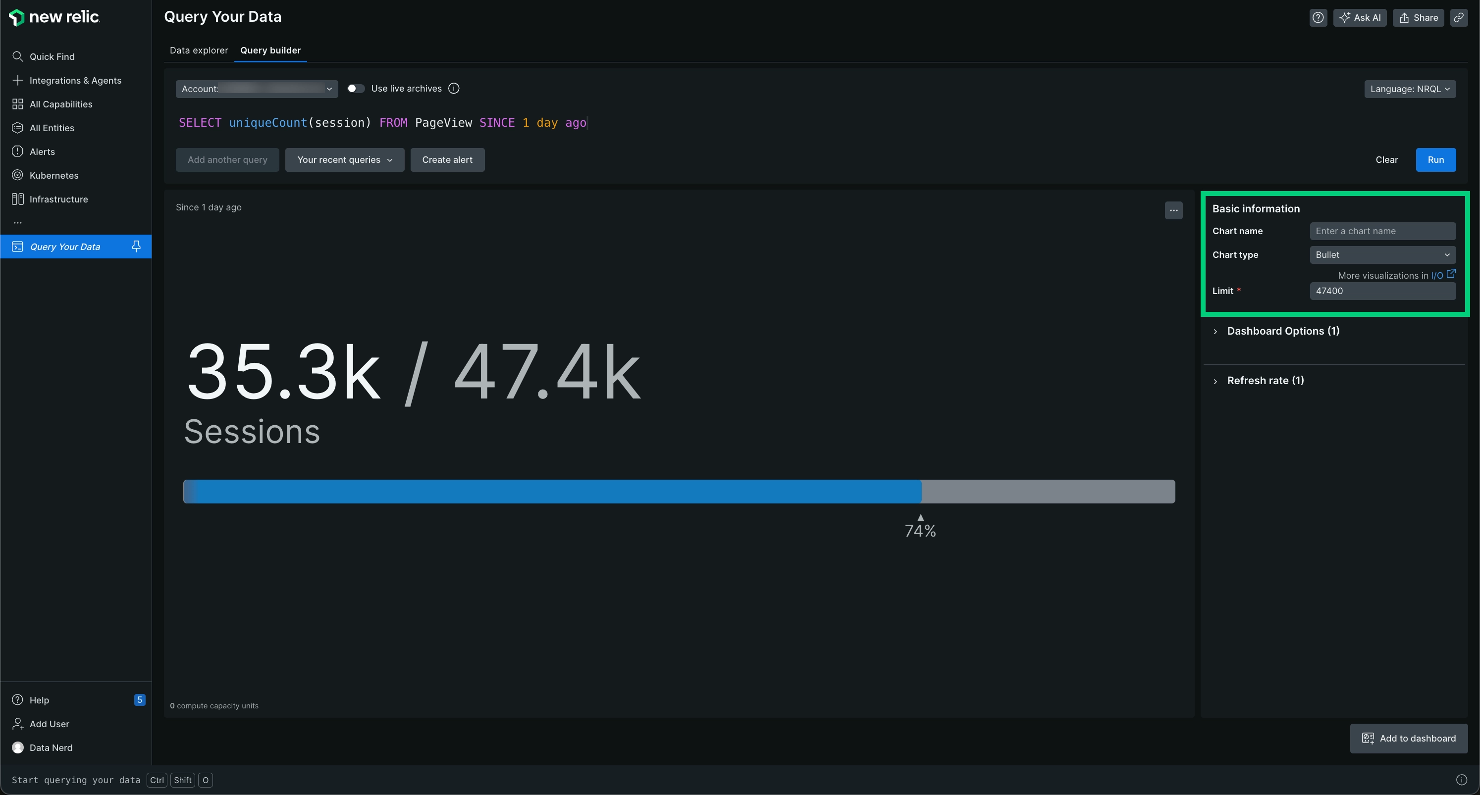
The bullet chart displays a value compared against a limit.
Bullet defaults to a limit that is twice the resulting query value. To adjust the limit, use the **Limit** field to enter another number. The bullet will adjust accordingly.
> #### 💡 TIP
>
> You can only use bullet charts for charts that present a single value. For example, a query using [`COMPARE WITH`](https://docs.newrelic.com/docs/insights/nrql-new-relic-query-language/nrql-reference/nrql-syntax-components-functions#sel-compare) won't list bullet as an option.
| Use a bullet chart when you want to | View a chart uses a large, easy-to-read font that helps you view the value quickly. |
| ------------------------------------- | ------------------------------------------------------------------------------------------------------------- |
| Avoid a bullet chart when you want to | View data that has more than a single value. Bar and line chart types may be better choices in this instance. |
## Funnel [#funnel]
Use [funnels](https://docs.newrelic.com/docs/insights/nrql-new-relic-query-language/nrql-query-examples/funnels-evaluate-data-series-events) to evaluate a series of related data types that make up the steps toward a specified goal. A funnel allows you to ask, “Of the people that did (A), how many also did (B), and of the people that did (A) and (B), how many also completed (C)?”
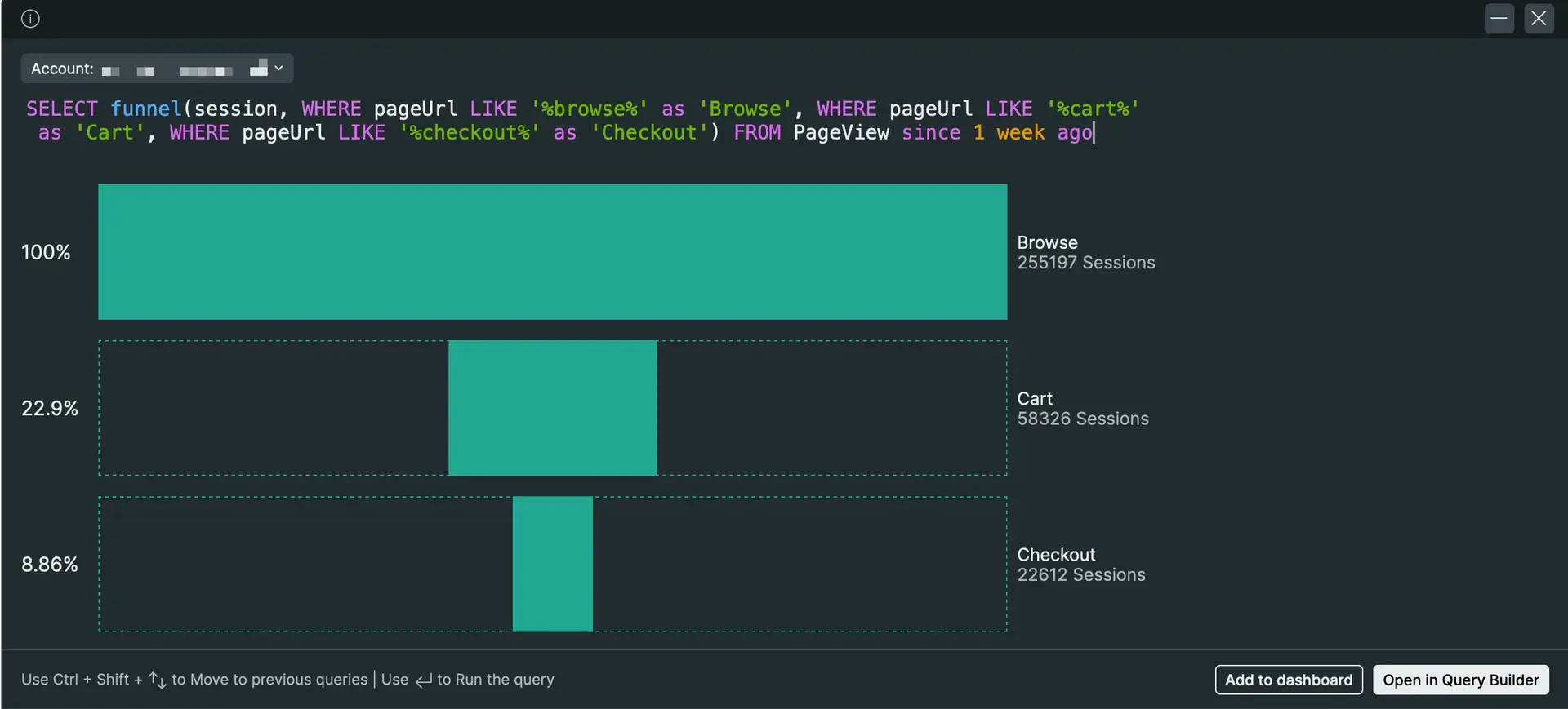
Sample funnel chart for a shopping site.
In this example, you want to determine that of all the visitors that viewed the landing page, how many of them:
- Browsed the products.
- Then added one or more products to a shopping cart.
- And finally, purchased the item(s) in the shopping cart.
Unlike other queries, you must use a [`SELECT`](https://docs.newrelic.com/docs/insights/nrql-new-relic-query-language/nrql-reference/nrql-syntax-components-functions#state-select) [`funnel()`](https://docs.newrelic.com/docs/insights/nrql-new-relic-query-language/nrql-reference/nrql-syntax-components-functions#func-funnel) statement in your query; the funnel chart type isn't selectable from any other type of query.
Additionally, the funnel chart type is only available for queries with eight steps or fewer. A funnel query that includes more than eight steps will only return the results as JSON.
```sql
SELECT funnel(session,
WHERE pageUrl like '%/index.html' AS 'Landing',
WHERE pageUrl LIKE '%/browse/phones' AS 'Browse',
WHERE pageUrl LIKE '%/shoppingcart' AS 'Cart',
WHERE pageUrl LIKE '%/checkout' AS 'Purchased')
FROM PageView WHERE appName = 'WebPortal' AND duration < 1
SINCE 1 week ago
```
| Use a funnel when you want to | You want to visually evaluate the paths that visitors take after they hit a page that you designate as a landing page. |
| ------------------------------- | ------------------------------------------------------------------------------------------------------------------------------------------------------------------------------------------------------------------------------------------------------------------------------------------ |
| Avoid a funnel when you want to | You only want counts for the attributes in the [`WHERE`](https://docs.newrelic.com/docs/insights/nrql-new-relic-query-language/nrql-reference/nrql-syntax-components-functions#where-operator) clause. You will not be able to choose funnel unless you use `SELECT funnel` in your query. |
## Gauge [#widget-gauge]
The gauge chart type displays a single value as a filled arc within a range you define, making it easy to see at a glance where a value falls relative to its minimum, maximum, and any thresholds you set. It's an option when your query returns a single number, such as from this query:
```sql
SELECT average(cpuPercent) AS 'CPU Usage (%)' FROM SystemSample SINCE 1 hour ago
```
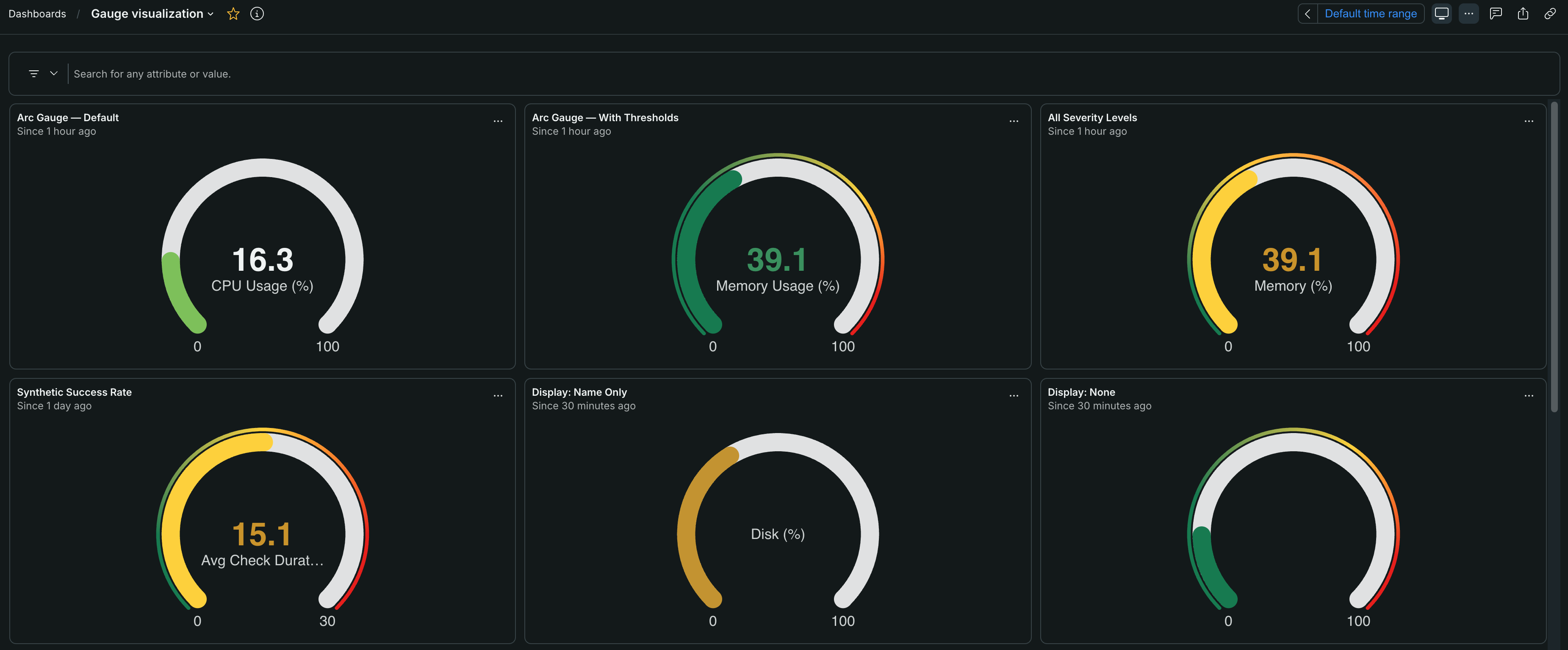
Gauge charts on a dashboard. Each gauge fills an arc to show where a single value sits between its minimum and maximum, and threshold colors indicate when a value enters a warning or critical range.
To use a gauge chart, run a query that returns a single value. You can show multiple gauges at once by adding a facet. A faceted query renders a grid of gauges, one for each facet value.
```sql
SELECT average(cpuPercent) FROM SystemSample FACET hostname SINCE 1 hour ago LIMIT 6
```
**Thresholds**
Optionally, set thresholds to color the gauge based on its value. Gauge charts support **Good**, **Warning**, **Approaching critical**, **Critical**, and **Neutral** thresholds. Each threshold takes effect from a value you specify, and the gauge changes color as the value crosses into each range. Use the **Neutral** threshold to mark a range that's neither healthy nor unhealthy, so the gauge doesn't signal a good or bad state for those values.
Here are some tips to help you with thresholds:
- Set each threshold to start at a value you choose. A threshold applies until the next one begins, and the first threshold starts at the gauge's minimum.
- To highlight a gauge when a value is too high (higher is worse), order your thresholds from low to high. To highlight when a value is too low (higher is better, such as available capacity), invert the order so the most severe threshold starts at the minimum.
- Use the **Show threshold markers** setting to display tick marks on the arc at each threshold boundary.
**Gauge settings**
You can configure the following settings for a gauge chart:
| Field name | Description |
| ---------------------- | ----------------------------------------------------------------------------------------------------------------------------- |
| Minimum | Set the lowest value of the gauge's range. The arc begins filling from this value. |
| Maximum | Set the highest value of the gauge's range. The arc is full at this value. |
| Label display | Select which labels the gauge shows. You can choose **Auto**, **Value and name**, **Value only**, **Name only**, or **None**. |
| Show threshold markers | Show or hide tick marks on the arc at each threshold boundary. |
**Uses**
| Use a gauge chart when you want to | Monitor a single value against a fixed range and thresholds, such as CPU, memory, or disk usage as a percentage of capacity, in a compact, easy-to-read visual. |
| ------------------------------------ | ------------------------------------------------------------------------------------------------------------------------------------------------------------------------- |
| Avoid a gauge chart when you want to | View how a value changes over time, or display more than a single value per series. The [line chart type](#widget-linechart) is a better option for viewing data by time. |
## Heat map [#widget-heatmap]
A heat map is a visualization tool that uses color gradations to represent data frequency across time intervals. This method is effective for quickly interpreting complex data patterns.
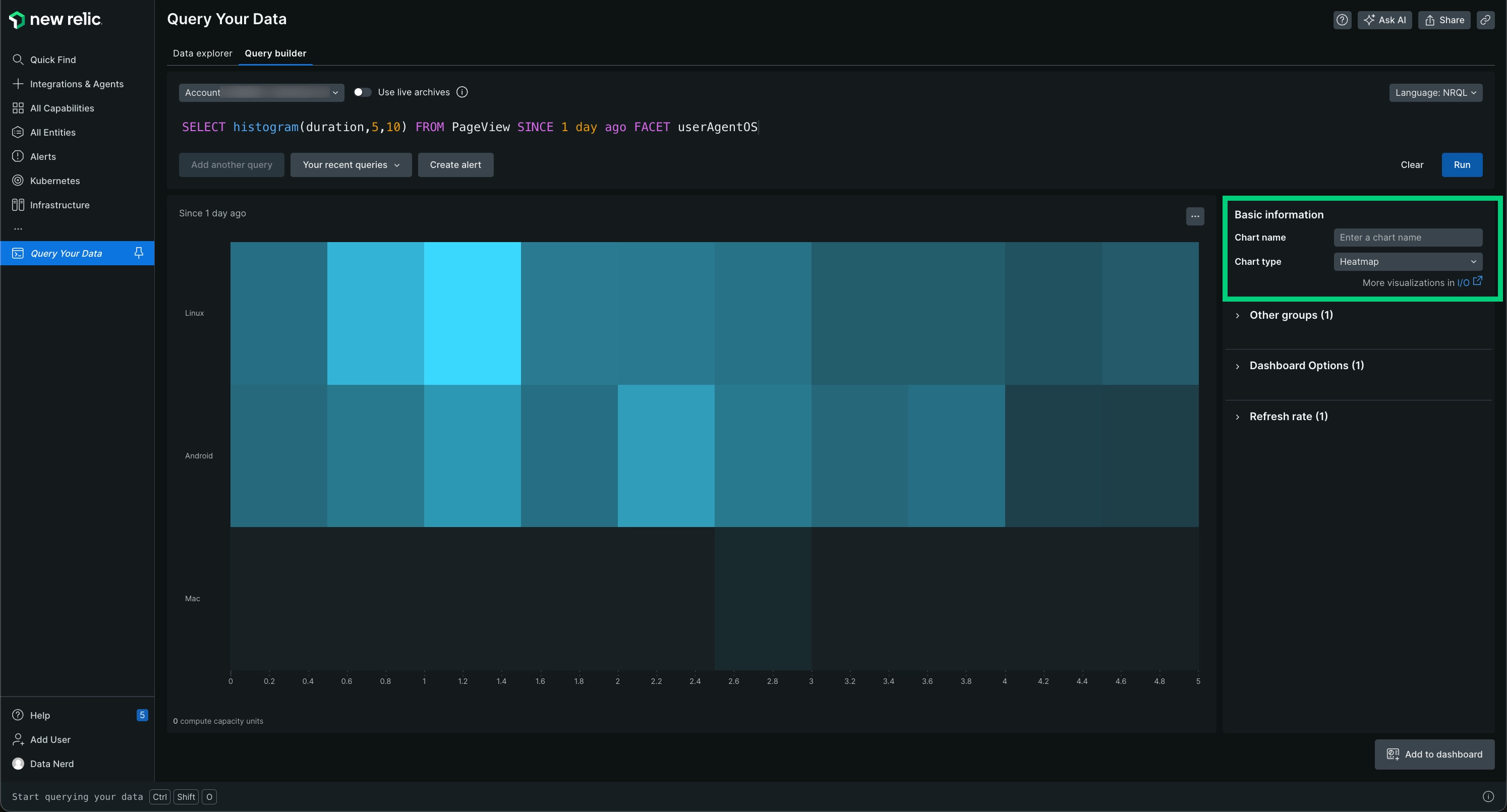
The heat map is a faceted distribution of values where color density represents the values displayed.
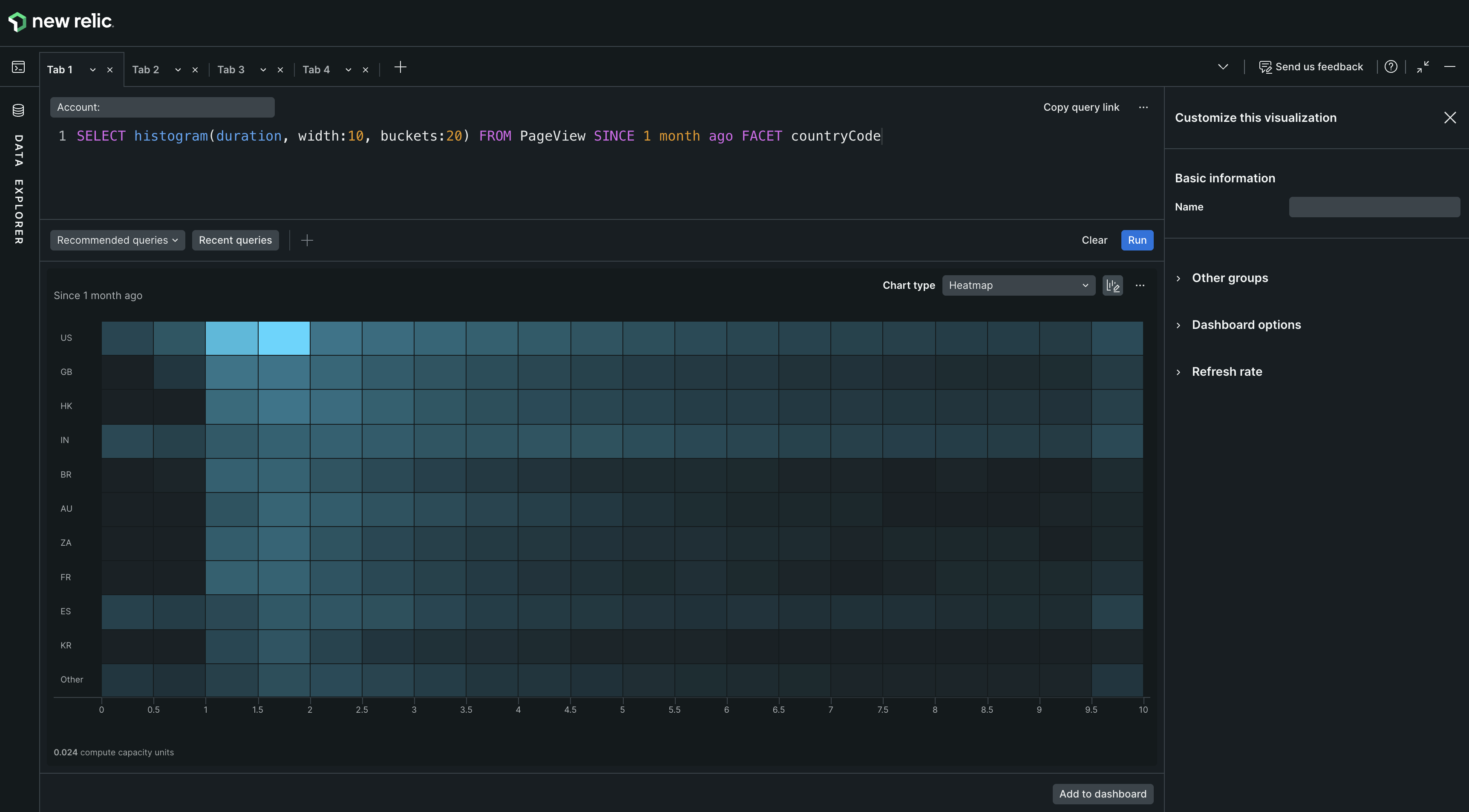
Heat maps visually portray histograms by dividing data into segments within a defined range, such as 0 to 10, using color density to reflect frequency.
**Facet and TimeSeries in heat map**
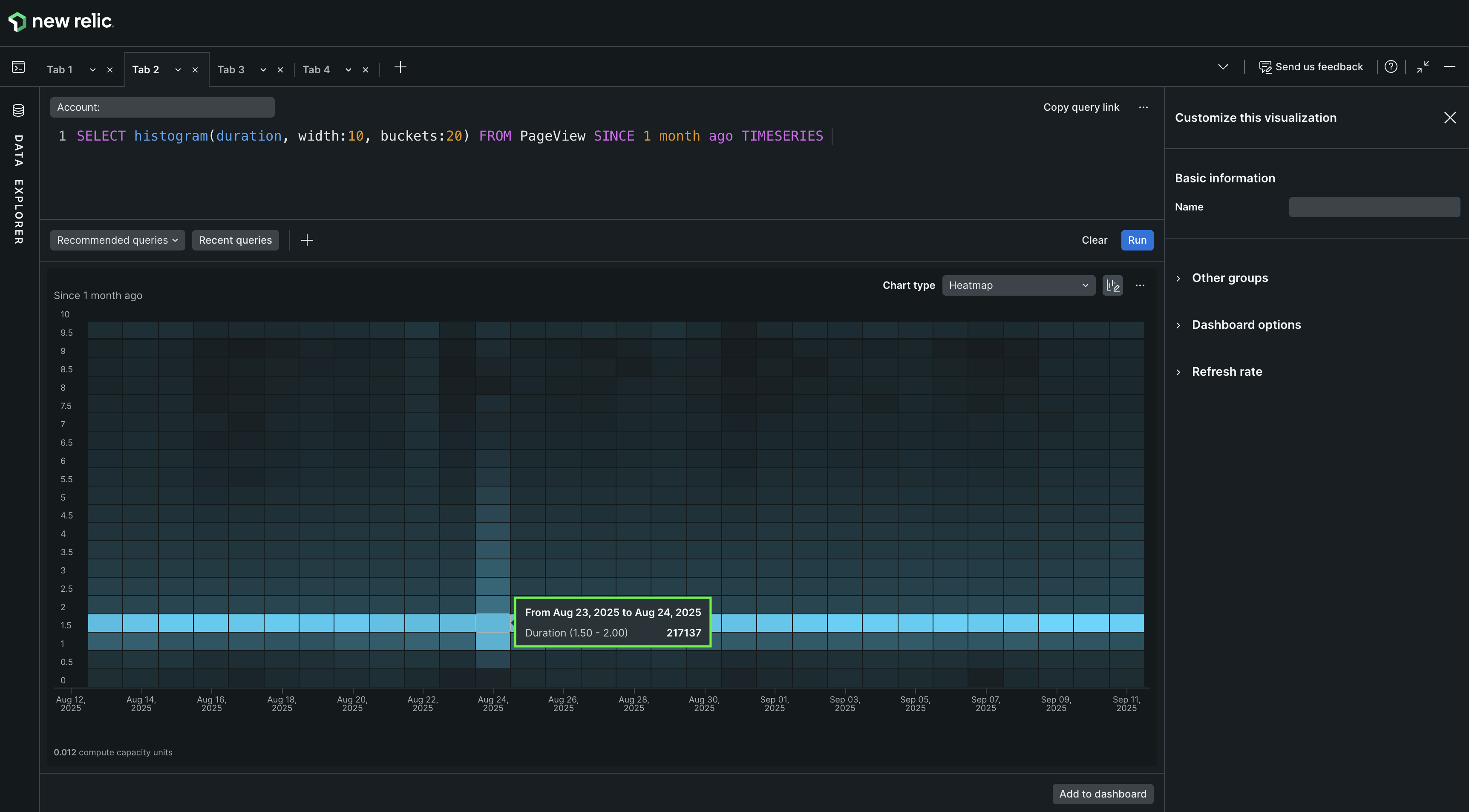
`Facet` allows categorization of data by attributes such as geographical regions—like Spain, Brazil, or the US—enabling comparisons across different segments. The integration of `TIMESERIES` feature divides the histogram data into equal time buckets, effectively representing it along a timeline similar to line or area, and using color intensity to highlight frequency changes over extended periods.
**Query using Facet**
````bash
SELECT histogram(duration, width:10, buckets:20) FROM PageView SINCE 1 month ago FACET countryCode
```
 ````
**Query using TIMESERIES**
````bash
SELECT histogram(duration, width:10, buckets:20) FROM PageView SINCE 1 month ago TIMESERIES
```
````
**Query using TIMESERIES**
````bash
SELECT histogram(duration, width:10, buckets:20) FROM PageView SINCE 1 month ago TIMESERIES
```
 ````
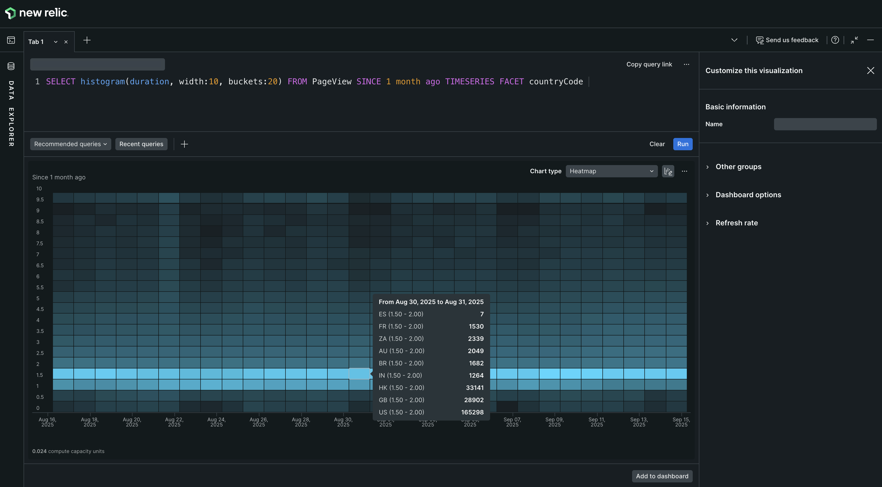
By integrating `Facet` with `TIMESERIES`, heat maps offer three-dimensional views and utilize tooltips for detailed context, such as country codes.
**Query combining Facet and TIMESERIES**
````bash
SELECT histogram(duration, width:10, buckets:20) FROM PageView SINCE 1 month ago TIMESERIES FACET countryCode
```
````
By integrating `Facet` with `TIMESERIES`, heat maps offer three-dimensional views and utilize tooltips for detailed context, such as country codes.
**Query combining Facet and TIMESERIES**
````bash
SELECT histogram(duration, width:10, buckets:20) FROM PageView SINCE 1 month ago TIMESERIES FACET countryCode
```
 ````
To enable a heat map, use the [`Histogram()`](https://docs.newrelic.com/docs/insights/nrql-new-relic-query-language/nrql-reference/nrql-syntax-components-functions#func-histogram) function with a numeric attribute and use [`FACET`](https://docs.newrelic.com/docs/insights/nrql-new-relic-query-language/nrql-reference/nrql-syntax-components-functions#sel-facet) to add up to five attributes, separated by commas or use `TIMESERIES` together with the histogram function.
See [Histograms: View data distribution](https://docs.newrelic.com/docs/using-new-relic/user-interface-functions/view-your-data/histograms-view-data-distribution) for more detailed information about histogram-based charts.
| Use a heat map when you want to | Visualize tabular data with multiple attributes over time using color gradations instead of numeric values. |
| --------------------------------- | ------------------------------------------------------------------------------------------------------------------------------------------- |
| Avoid a heat map when you want to | Obtain precise numerical data for multiple attributes across a period. Consider using line or bar charts for exact numeric representations. |
## Histogram [#widget-histogram]
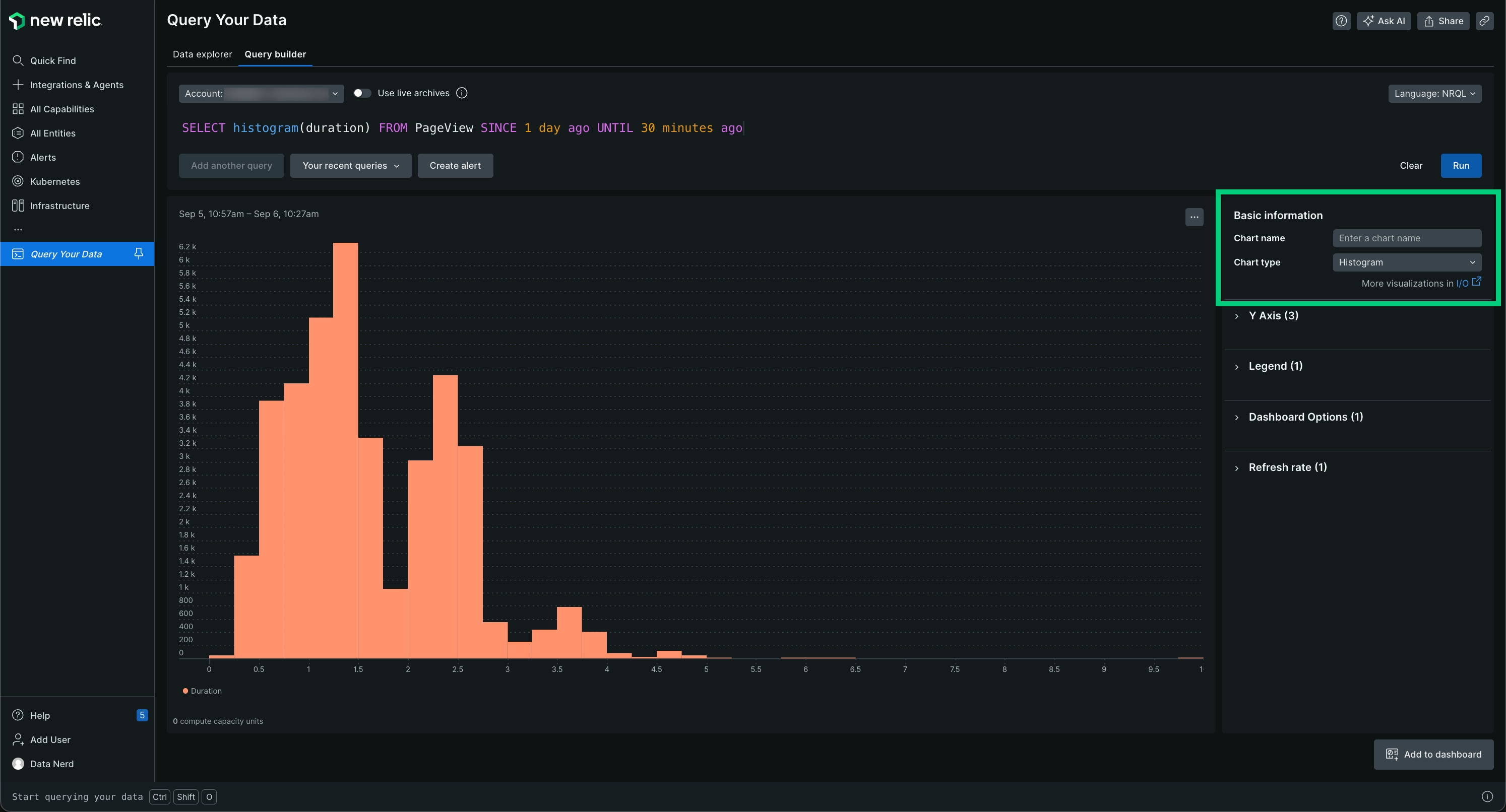
A histogram charts frequency across a series of value ranges.
Use histograms to show the distribution of data across time buckets. See [Histograms: View data distribution](https://docs.newrelic.com/docs/using-new-relic/user-interface-functions/view-your-data/histograms-view-data-distribution) for more detailed information about histogram-based charts.
| Use a histogram when you want to | Chart frequency of data over a series of values. |
| ---------------------------------- | ------------------------------------------------------------------------------------------------------------------ |
| Avoid a histogram when you want to | View the same data as [heat](#widget-heatmap) [map](#widget-heatmap) or to view the data without the time buckets. |
## JSON [#widget-json]
Use the returned JSON to review the raw data returned and to help develop integrations with New Relic. To implement integrations, use [remote queries](https://docs.newrelic.com/docs/insights/new-relic-insights/adding-querying-data/querying-your-data-remotely) to return raw JSON as a service.
To use this, select the **Share** menu and click **Copy JSON**.
Example NRQL query:
```sql
SELECT uniqueCount(name) FROM Transaction
WHERE http.statusCode = '200'
TIMESERIES
FACET appName
LIMIT 10
SINCE 24 hours ago
```
Example JSON response:
```json
{
"metadata": {
"contents": {
"messages": [],
"timeSeries": {
"messages": [],
"contents": [
{
"function": "uniquecount",
"attribute": "name",
"simple": true
}
]
},
"bucketSizeMillis": 1800000
},
"eventTypes": [
"Transaction"
],
"eventType": "Transaction",
"openEnded": true,
"messages": [],
"beginTimeMillis": 1556226069396,
"endTimeMillis": 1556312469396,
"beginTime": "2019-04-25T21:01:09Z",
"endTime": "2019-04-26T21:01:09Z",
"guid": "5238a2c6-328d-a5ff-9185-7f3f04c42d1e",
"routerGuid": "1aea2ec5-0be8-3a60-7554-851e1b016eb0",
"rawSince": "24 HOURS AGO",
"rawUntil": "NOW",
"rawCompareWith": "",
"facet": "appName",
"offset": 0,
"limit": 10
},
"facets": [
{
"name": "RPM Combined Production",
"beginTimeSeconds": 0,
"endTimeSeconds": 0,
"timeSeries": [
{
"results": [
{
"uniqueCount": 415
}
],
"beginTimeSeconds": 1556226069,
"endTimeSeconds": 1556227869,
"inspectedCount": 4589471
},
[
{
"uniqueCount": 1714
}
],
"beginTimeSeconds": 1556310669,
"endTimeSeconds": 1556312469,
"inspectedCount": 53341469
}
],
"total": {
"results": [
{
"uniqueCount": 2651
}
],
"beginTimeSeconds": 0,
"endTimeSeconds": 0,
"inspectedCount": 5053841114
}
},
"performanceStats": {
"inspectedCount": 6088068932,
"responseTime": 8077
}
}
...
```
## Line [#widget-linechart]
A line chart is useful for spotting trends over time.
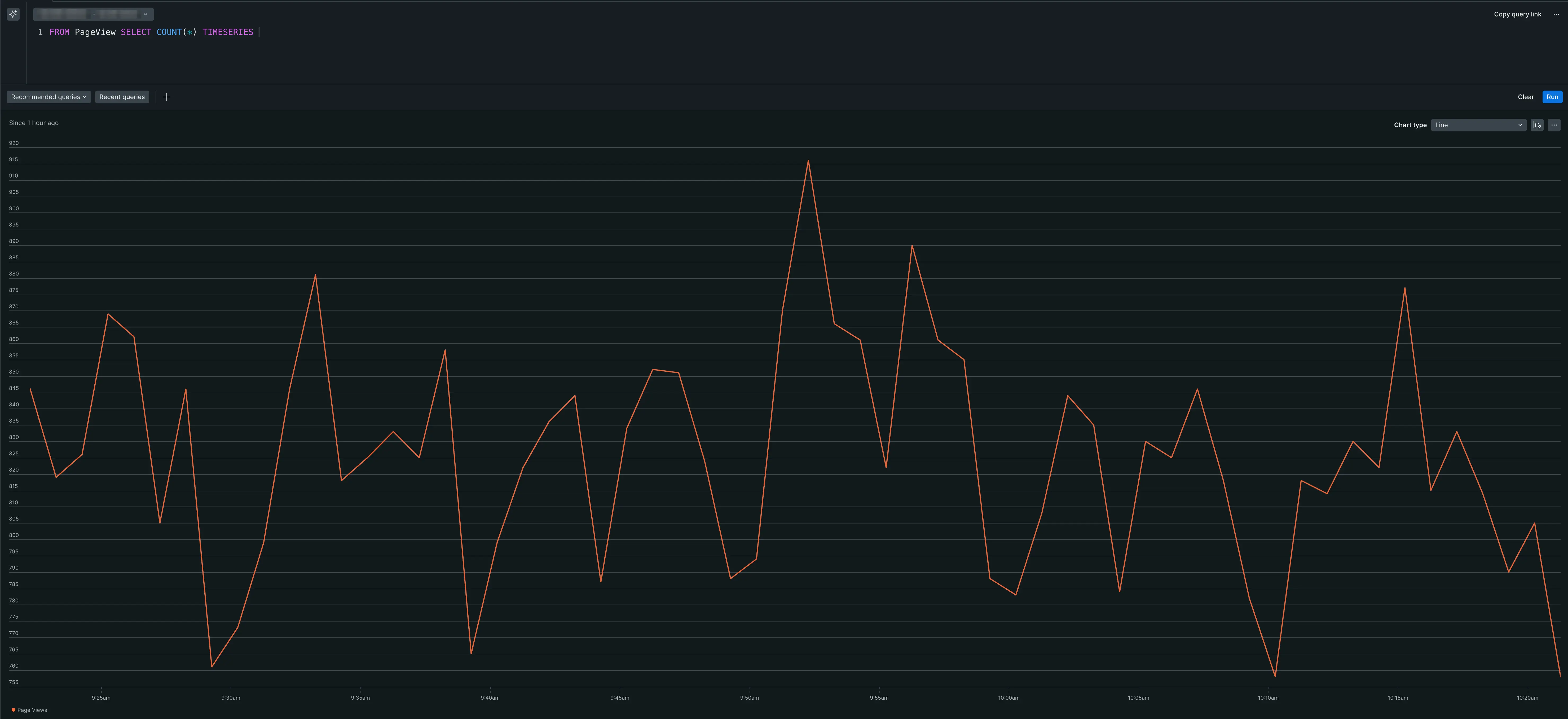
The line chart plots a time series for an attribute.
When working in basic query mode, select a single attribute you can plot over time.
When using NRQL, [`SELECT`](https://docs.newrelic.com/docs/query-your-data/nrql-new-relic-query-language/get-started/nrql-syntax-clauses-functions/#state-select) one or more attributes you can plot over time and then use the [`TIMESERIES`](https://docs.newrelic.com/docs/insights/nrql-new-relic-query-language/nrql-reference/nrql-syntax-components-functions#sel-timeseries) function.
| Use a line chart when you want to | Create a chart that lets you easily view trends over a specified time frame. |
| ----------------------------------- | --------------------------------------------------------------------------------------------------------------------------------- |
| Avoid a line chart when you want to | View your data using one or more attributes and see the values associated with each attribute. A bar or table chart is an option. |
## Pie chart [#widget-piechart]
A pie chart is the graphic representation of the table. It appears as an option for some functions when the [`FACET`](https://docs.newrelic.com/docs/insights/nrql-new-relic-query-language/nrql-reference/nrql-syntax-components-functions#sel-facets) clause is used. To use this chart type, run a query that returns one value for each of a set of attributes.
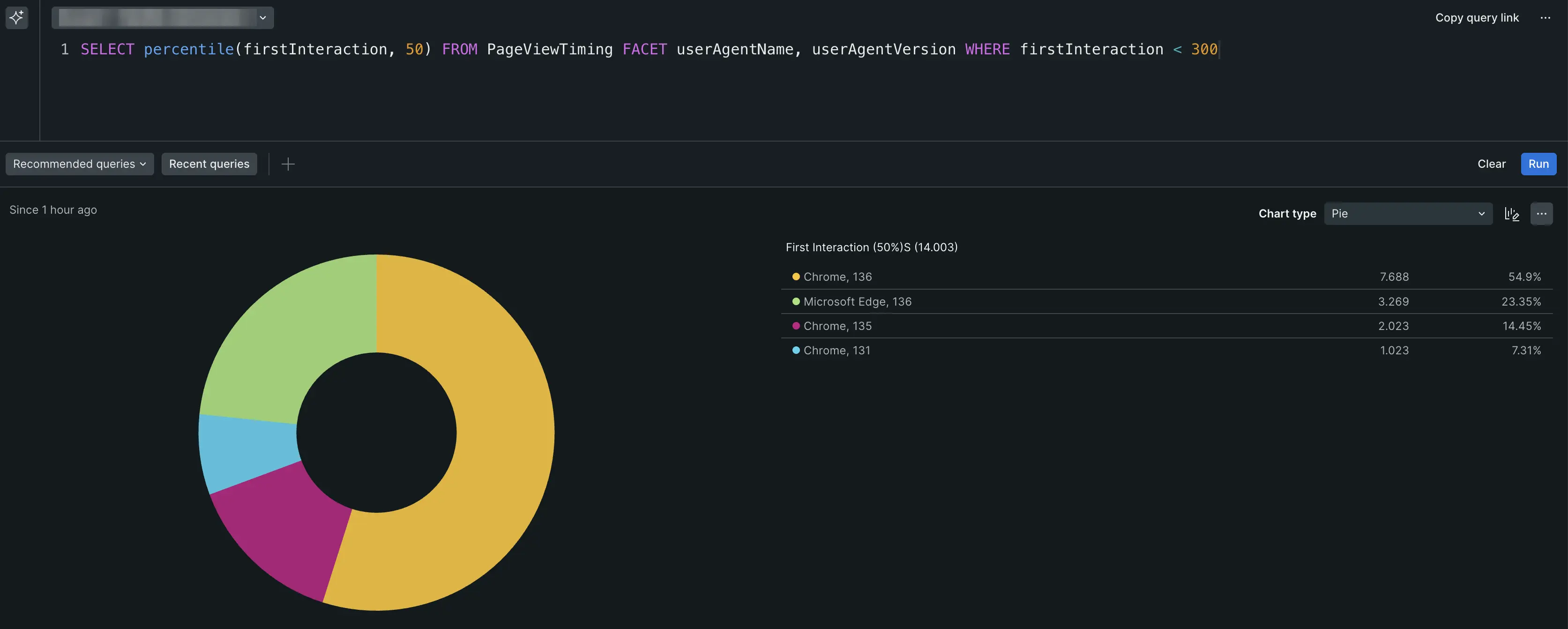
The pie chart maps a set of values as a portion of a whole.
To enable pie chart, add a [`FACET`](https://docs.newrelic.com/docs/insights/nrql-new-relic-query-language/nrql-reference/nrql-syntax-components-functions#sel-facet) from the dropdown.
You can add only one `FACET` in basic query mode. If you're using NRQL, you can use `FACET` to add up to 5 attributes, separated by commas, and also include the [`TIMESERIES`](https://docs.newrelic.com/docs/insights/nrql-new-relic-query-language/nrql-reference/nrql-syntax-components-functions#sel-timeseries) function.
> #### ⚠️ IMPORTANT
>
> The following [aggregator functions](https://docs.newrelic.com/docs/insights/new-relic-insights/using-new-relic-query-language/nrql-reference#functions) require a `FACET` clause to be visualized as pie charts: `average`, `apdex`, `min`, `max`, `percentage`, and `percentile`. For example, `SELECT percentile(duration) FROM Transaction FACET appName` is pie compatible, but `SELECT percentile(duration) FROM Transaction` is not.
For `uniqueCount`, percentages [may add up to more than 100%](#pie-percentage-problem).
| Use a pie chart when you want to | Create a chart that that graphically presents a set of values as they relate to a whole. A pie chart is effective for displaying values for a time period, for example. |
| ---------------------------------- | ----------------------------------------------------------------------------------------------------------------------------------------------------------------------- |
| Avoid a pie chart when you want to | Present data that does not use values as they related to a whole, such as with line charts. |
### Pie chart percentage problem [#pie-percentage-problem]
When using a pie chart with the [`uniqueCount`](https://docs.newrelic.com/docs/insights/nrql-new-relic-query-language/nrql-resources/nrql-syntax-components-functions#func-uniqueCount) aggregator function, the percentages can add up to more than 100%. This is because the attributes being uniquely counted may be present in multiple facets. For example, in the query `SELECT uniqueCount(user) FROM PageView FACET appName`, a single unique user may use multiple apps. Each of these users are included in the unique value for each of the appropriate facets (apps), but the total number of unique users won't change.
To solve this, use a [bar chart](#widget-barchart) or [table](#widget-table) to provide a more accurate visualization of `uniqueCount` data.
## Simplified bar chart [#widget-simplified-barchart]
The simplified bar chart compares multiple series against the largest series, which the chart always treats as 100% of the bar width. It shows the other series relative to that largest series.
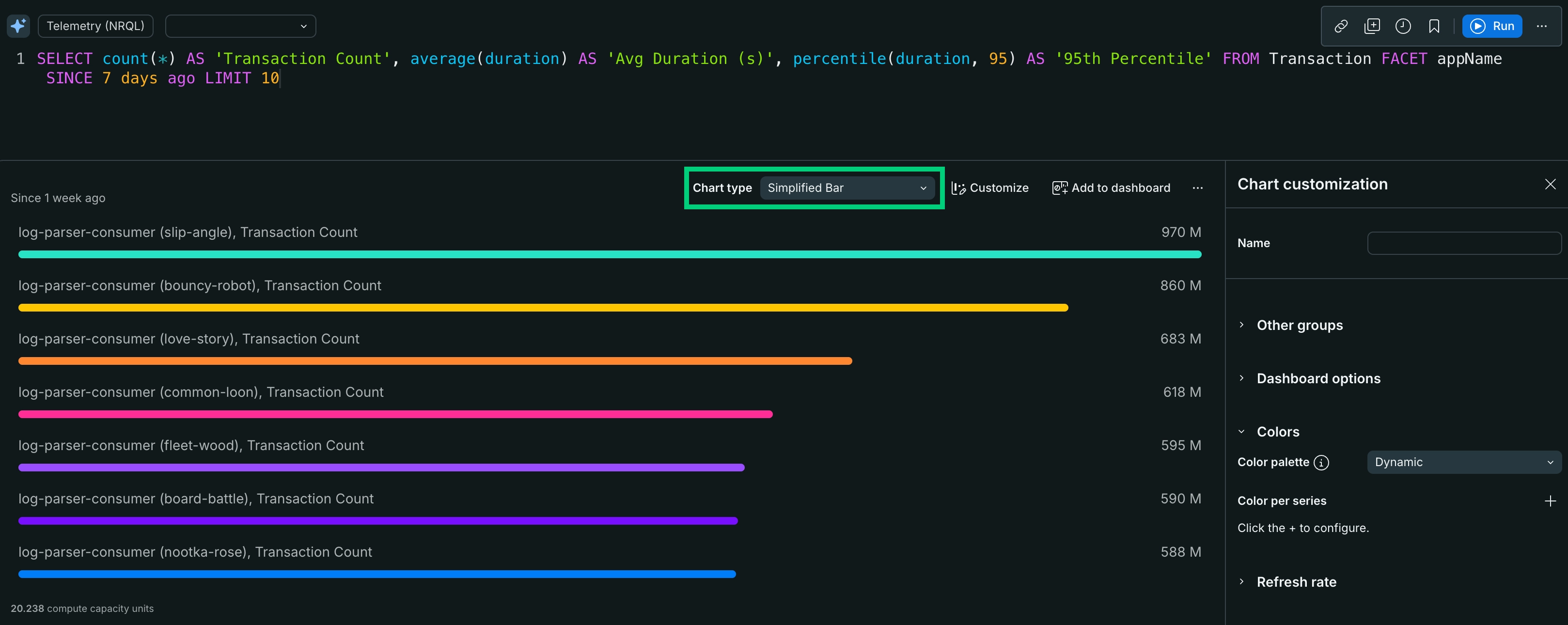
The simplified bar chart ranks a set of series against the largest one.
To enable a simplified bar chart, add a [`FACET`](https://docs.newrelic.com/docs/insights/nrql-new-relic-query-language/nrql-reference/nrql-syntax-components-functions#sel-facet) clause to the query. You can use `FACET` with up to 5 different attributes, separated by commas. Because the bar chart is the default for these queries, run your query and then select **Simplified Bar** from the **Chart type** dropdown.
The simplified bar chart provides infinite-series scrolling and horizontal, collision-free labels, and it fixes the first series at 100% of the bar width.
| Use a simplified bar chart when you want to | Compare multiple series against the largest series, which the chart treats as 100% of the bar width. |
| --------------------------------------------- | ------------------------------------------------------------------------------------------------------------------------------------------------------------------------------------------------------------------------------------------------------------------------------------------------------------------------------------- |
| Avoid a simplified bar chart when you want to | Include measurements over a period of time. This chart type isn't available when using a [TIMESERIES](https://docs.newrelic.com/docs/query-data/nrql-new-relic-query-language/getting-started/nrql-syntax-clauses-functions#sel-timeseries) clause. The [line chart type](#widget-linechart) is a good option for this visualization. |
## Table [#widget-table]
A table is the standard view for a set of values related to a specific attribute (for example, the count of all page views by user agent name, log details, etc.). By default, all tables are sortable by any one column.
If you are using the [`FACET`](https://docs.newrelic.com/docs/insights/nrql-new-relic-query-language/nrql-reference/nrql-syntax-components-functions#sel-facet) clause, the results will normally be returned as a table.
You can use a table as a shortcut to other dashboards. If a table is faceted by attribute, selecting an entry takes you to an existing dashboard [filtered by that attribute](https://docs.newrelic.com/docs/query-your-data/explore-query-data/dashboards/filter-new-relic-one-dashboards-facets/).
You can also export a table chart to a CSV file.
- If a filter is applied to a dashboard, the download will only include the subset of data based on the filter.
- If a specific fixed time range is selected, the CSV includes the data for that time period.
- If you query with multiple attributes, the export includes columns for all `FACET`s in the query.
- For charts with a time range dependent on the present moment (for example, `since 30 minutes ago`), the data in the CSV is generated from the present moment, not from when the chart was initially generated.
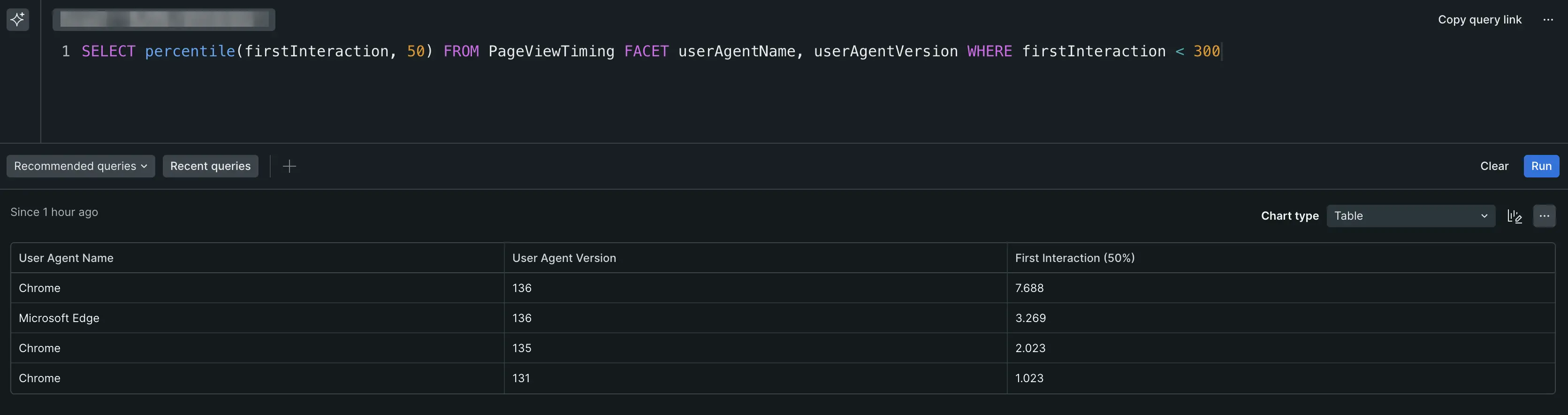
The table chart type, with its tabular format, works well for dashboards, as well as for sharing the data in reports.
| Use a table when you want to | Create a text-compatible table consisting of your data. This table can be shared and used in reports or imported into spreadsheets, for example. |
| ------------------------------ | ------------------------------------------------------------------------------------------------------------------------------------------------ |
| Avoid a table when you want to | View your data in a graphical format. |
````
To enable a heat map, use the [`Histogram()`](https://docs.newrelic.com/docs/insights/nrql-new-relic-query-language/nrql-reference/nrql-syntax-components-functions#func-histogram) function with a numeric attribute and use [`FACET`](https://docs.newrelic.com/docs/insights/nrql-new-relic-query-language/nrql-reference/nrql-syntax-components-functions#sel-facet) to add up to five attributes, separated by commas or use `TIMESERIES` together with the histogram function.
See [Histograms: View data distribution](https://docs.newrelic.com/docs/using-new-relic/user-interface-functions/view-your-data/histograms-view-data-distribution) for more detailed information about histogram-based charts.
| Use a heat map when you want to | Visualize tabular data with multiple attributes over time using color gradations instead of numeric values. |
| --------------------------------- | ------------------------------------------------------------------------------------------------------------------------------------------- |
| Avoid a heat map when you want to | Obtain precise numerical data for multiple attributes across a period. Consider using line or bar charts for exact numeric representations. |
## Histogram [#widget-histogram]

A histogram charts frequency across a series of value ranges.
Use histograms to show the distribution of data across time buckets. See [Histograms: View data distribution](https://docs.newrelic.com/docs/using-new-relic/user-interface-functions/view-your-data/histograms-view-data-distribution) for more detailed information about histogram-based charts.
| Use a histogram when you want to | Chart frequency of data over a series of values. |
| ---------------------------------- | ------------------------------------------------------------------------------------------------------------------ |
| Avoid a histogram when you want to | View the same data as [heat](#widget-heatmap) [map](#widget-heatmap) or to view the data without the time buckets. |
## JSON [#widget-json]
Use the returned JSON to review the raw data returned and to help develop integrations with New Relic. To implement integrations, use [remote queries](https://docs.newrelic.com/docs/insights/new-relic-insights/adding-querying-data/querying-your-data-remotely) to return raw JSON as a service.
To use this, select the **Share** menu and click **Copy JSON**.
Example NRQL query:
```sql
SELECT uniqueCount(name) FROM Transaction
WHERE http.statusCode = '200'
TIMESERIES
FACET appName
LIMIT 10
SINCE 24 hours ago
```
Example JSON response:
```json
{
"metadata": {
"contents": {
"messages": [],
"timeSeries": {
"messages": [],
"contents": [
{
"function": "uniquecount",
"attribute": "name",
"simple": true
}
]
},
"bucketSizeMillis": 1800000
},
"eventTypes": [
"Transaction"
],
"eventType": "Transaction",
"openEnded": true,
"messages": [],
"beginTimeMillis": 1556226069396,
"endTimeMillis": 1556312469396,
"beginTime": "2019-04-25T21:01:09Z",
"endTime": "2019-04-26T21:01:09Z",
"guid": "5238a2c6-328d-a5ff-9185-7f3f04c42d1e",
"routerGuid": "1aea2ec5-0be8-3a60-7554-851e1b016eb0",
"rawSince": "24 HOURS AGO",
"rawUntil": "NOW",
"rawCompareWith": "",
"facet": "appName",
"offset": 0,
"limit": 10
},
"facets": [
{
"name": "RPM Combined Production",
"beginTimeSeconds": 0,
"endTimeSeconds": 0,
"timeSeries": [
{
"results": [
{
"uniqueCount": 415
}
],
"beginTimeSeconds": 1556226069,
"endTimeSeconds": 1556227869,
"inspectedCount": 4589471
},
[
{
"uniqueCount": 1714
}
],
"beginTimeSeconds": 1556310669,
"endTimeSeconds": 1556312469,
"inspectedCount": 53341469
}
],
"total": {
"results": [
{
"uniqueCount": 2651
}
],
"beginTimeSeconds": 0,
"endTimeSeconds": 0,
"inspectedCount": 5053841114
}
},
"performanceStats": {
"inspectedCount": 6088068932,
"responseTime": 8077
}
}
...
```
## Line [#widget-linechart]
A line chart is useful for spotting trends over time.

The line chart plots a time series for an attribute.
When working in basic query mode, select a single attribute you can plot over time.
When using NRQL, [`SELECT`](https://docs.newrelic.com/docs/query-your-data/nrql-new-relic-query-language/get-started/nrql-syntax-clauses-functions/#state-select) one or more attributes you can plot over time and then use the [`TIMESERIES`](https://docs.newrelic.com/docs/insights/nrql-new-relic-query-language/nrql-reference/nrql-syntax-components-functions#sel-timeseries) function.
| Use a line chart when you want to | Create a chart that lets you easily view trends over a specified time frame. |
| ----------------------------------- | --------------------------------------------------------------------------------------------------------------------------------- |
| Avoid a line chart when you want to | View your data using one or more attributes and see the values associated with each attribute. A bar or table chart is an option. |
## Pie chart [#widget-piechart]
A pie chart is the graphic representation of the table. It appears as an option for some functions when the [`FACET`](https://docs.newrelic.com/docs/insights/nrql-new-relic-query-language/nrql-reference/nrql-syntax-components-functions#sel-facets) clause is used. To use this chart type, run a query that returns one value for each of a set of attributes.

The pie chart maps a set of values as a portion of a whole.
To enable pie chart, add a [`FACET`](https://docs.newrelic.com/docs/insights/nrql-new-relic-query-language/nrql-reference/nrql-syntax-components-functions#sel-facet) from the dropdown.
You can add only one `FACET` in basic query mode. If you're using NRQL, you can use `FACET` to add up to 5 attributes, separated by commas, and also include the [`TIMESERIES`](https://docs.newrelic.com/docs/insights/nrql-new-relic-query-language/nrql-reference/nrql-syntax-components-functions#sel-timeseries) function.
> #### ⚠️ IMPORTANT
>
> The following [aggregator functions](https://docs.newrelic.com/docs/insights/new-relic-insights/using-new-relic-query-language/nrql-reference#functions) require a `FACET` clause to be visualized as pie charts: `average`, `apdex`, `min`, `max`, `percentage`, and `percentile`. For example, `SELECT percentile(duration) FROM Transaction FACET appName` is pie compatible, but `SELECT percentile(duration) FROM Transaction` is not.
For `uniqueCount`, percentages [may add up to more than 100%](#pie-percentage-problem).
| Use a pie chart when you want to | Create a chart that that graphically presents a set of values as they relate to a whole. A pie chart is effective for displaying values for a time period, for example. |
| ---------------------------------- | ----------------------------------------------------------------------------------------------------------------------------------------------------------------------- |
| Avoid a pie chart when you want to | Present data that does not use values as they related to a whole, such as with line charts. |
### Pie chart percentage problem [#pie-percentage-problem]
When using a pie chart with the [`uniqueCount`](https://docs.newrelic.com/docs/insights/nrql-new-relic-query-language/nrql-resources/nrql-syntax-components-functions#func-uniqueCount) aggregator function, the percentages can add up to more than 100%. This is because the attributes being uniquely counted may be present in multiple facets. For example, in the query `SELECT uniqueCount(user) FROM PageView FACET appName`, a single unique user may use multiple apps. Each of these users are included in the unique value for each of the appropriate facets (apps), but the total number of unique users won't change.
To solve this, use a [bar chart](#widget-barchart) or [table](#widget-table) to provide a more accurate visualization of `uniqueCount` data.
## Simplified bar chart [#widget-simplified-barchart]
The simplified bar chart compares multiple series against the largest series, which the chart always treats as 100% of the bar width. It shows the other series relative to that largest series.

The simplified bar chart ranks a set of series against the largest one.
To enable a simplified bar chart, add a [`FACET`](https://docs.newrelic.com/docs/insights/nrql-new-relic-query-language/nrql-reference/nrql-syntax-components-functions#sel-facet) clause to the query. You can use `FACET` with up to 5 different attributes, separated by commas. Because the bar chart is the default for these queries, run your query and then select **Simplified Bar** from the **Chart type** dropdown.
The simplified bar chart provides infinite-series scrolling and horizontal, collision-free labels, and it fixes the first series at 100% of the bar width.
| Use a simplified bar chart when you want to | Compare multiple series against the largest series, which the chart treats as 100% of the bar width. |
| --------------------------------------------- | ------------------------------------------------------------------------------------------------------------------------------------------------------------------------------------------------------------------------------------------------------------------------------------------------------------------------------------- |
| Avoid a simplified bar chart when you want to | Include measurements over a period of time. This chart type isn't available when using a [TIMESERIES](https://docs.newrelic.com/docs/query-data/nrql-new-relic-query-language/getting-started/nrql-syntax-clauses-functions#sel-timeseries) clause. The [line chart type](#widget-linechart) is a good option for this visualization. |
## Table [#widget-table]
A table is the standard view for a set of values related to a specific attribute (for example, the count of all page views by user agent name, log details, etc.). By default, all tables are sortable by any one column.
If you are using the [`FACET`](https://docs.newrelic.com/docs/insights/nrql-new-relic-query-language/nrql-reference/nrql-syntax-components-functions#sel-facet) clause, the results will normally be returned as a table.
You can use a table as a shortcut to other dashboards. If a table is faceted by attribute, selecting an entry takes you to an existing dashboard [filtered by that attribute](https://docs.newrelic.com/docs/query-your-data/explore-query-data/dashboards/filter-new-relic-one-dashboards-facets/).
You can also export a table chart to a CSV file.
- If a filter is applied to a dashboard, the download will only include the subset of data based on the filter.
- If a specific fixed time range is selected, the CSV includes the data for that time period.
- If you query with multiple attributes, the export includes columns for all `FACET`s in the query.
- For charts with a time range dependent on the present moment (for example, `since 30 minutes ago`), the data in the CSV is generated from the present moment, not from when the chart was initially generated.

The table chart type, with its tabular format, works well for dashboards, as well as for sharing the data in reports.
| Use a table when you want to | Create a text-compatible table consisting of your data. This table can be shared and used in reports or imported into spreadsheets, for example. |
| ------------------------------ | ------------------------------------------------------------------------------------------------------------------------------------------------ |
| Avoid a table when you want to | View your data in a graphical format. |